LiBzCAREER 2017
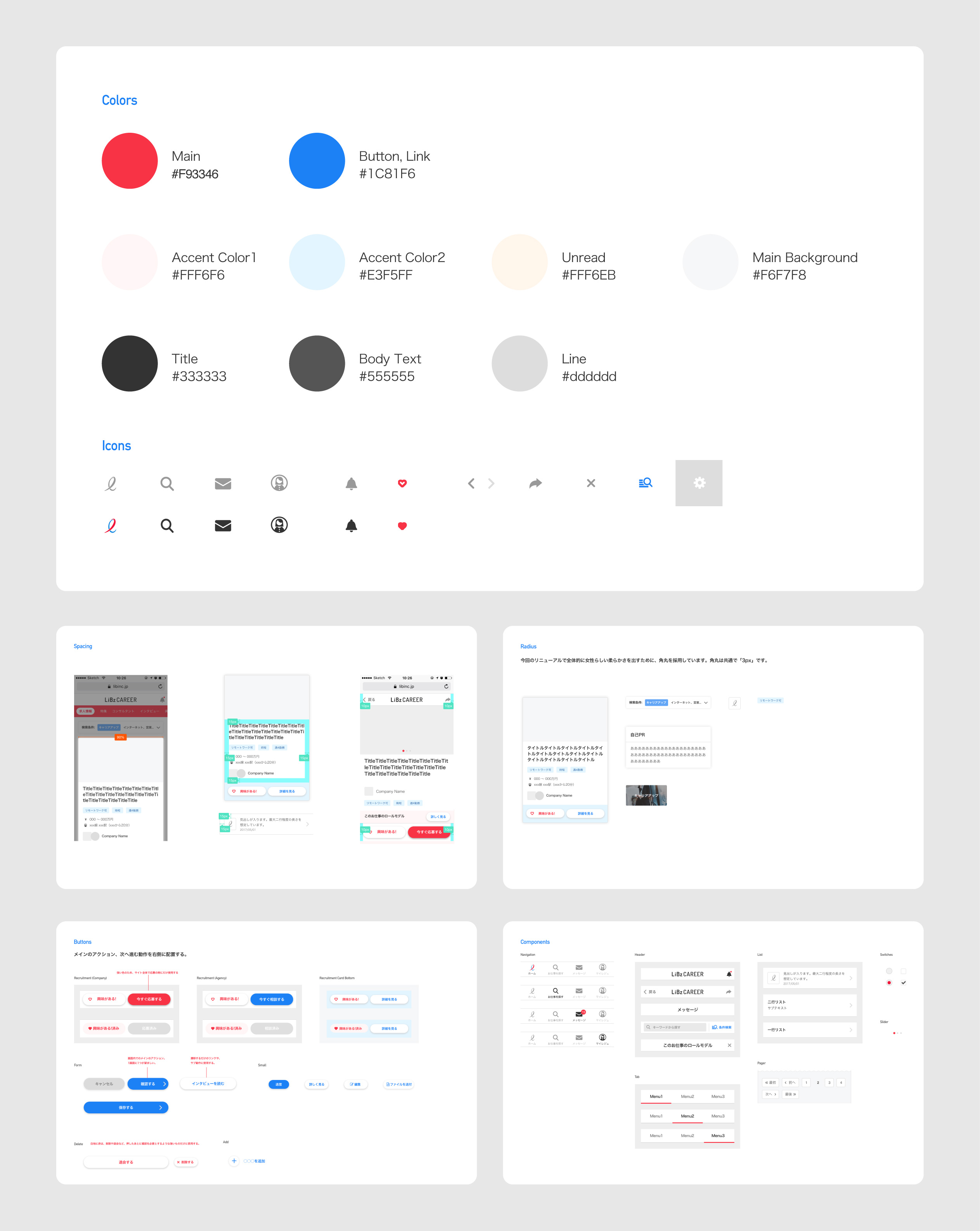
LiBzCAREER is a job search marketplace tailored to help women in Japan make the career move that’s right for them. I joined as a product designer to renew and improve the usability of the platform. When I joined the company, it had been 2 years since the product launched. There weren't any design rules implemented. So my first challenge was to develop a set of clear design guidelines to construct the brand, and allow the team to design more efficiently and consistently.
Guidelines
LiBzCAREER is on web and iOS, and each platform used different colors for some elements, such as unread messages. I defined the color palette, spacing rules, radius, and buttons. Lastly, I created design components that are shared across platforms and screens.

Job Search
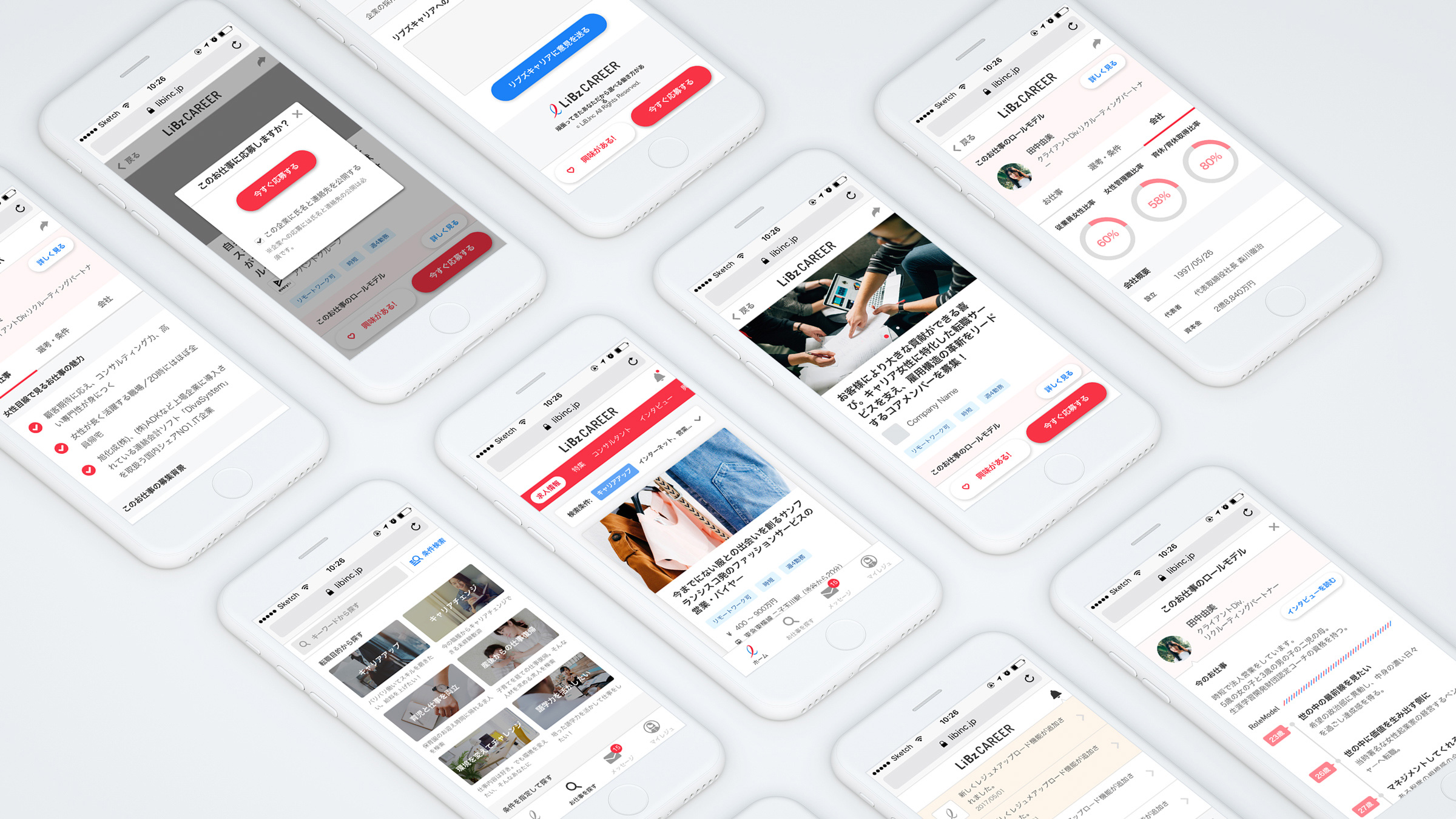
The company's mission is to provide a role model for women. Unfortunately, the ratio of females in manager position is low in Japan. In the job offer detail screen, we showed the ratio of females in managerial positions, the rate of employees taking child-care leave, and testimonials with real employees. Working women often face issues with the workplace when they approach a life event. We decided to provide a functionality in which they can search for jobs by several purposes for a need of a career change. For example: To come back from maternity leave / To keep working while raising children / To build new skills in another industry

Resume
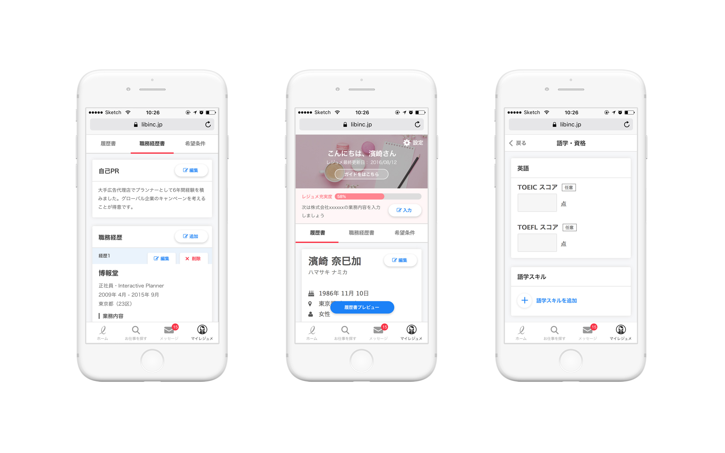
The resume editing screen was complicated. After doing some analysis, it came to light that this screen had a low completion rate, despite the fact that the information collected will help the candidates get accurately matched to companies. I designed a progress bar of the form completion, and a guide that shows what the candidate should do next. I also researched the completion rate of each item and interviewed recruiters about which of them they prioritize. This informed me to make changes to the order of the items in the editing screen, to get the most vital information more efficiently.

Direct Message
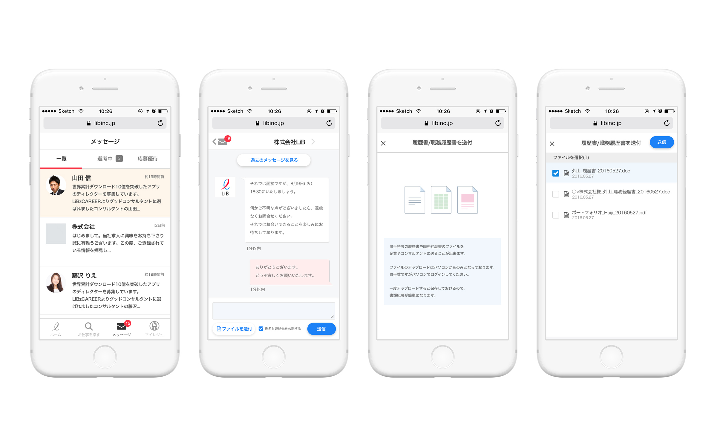
The direct messaging feature allowed the candidates to contact HR representatives or recruiters, but there was an issue that they received too many messages, and would often be difficult to sort through them. My solution was adding a navigation tab that sorts messages by the status of the screening process. Another issue was that almost all companies asked the candidates to send them a file of their resumes. We developed a functionality that allows for attachment files like Excel, Word, and PDF.
