Wonolo 2018
Wonolo is a convenient online staffing service that connects job seekers with companies who are looking to fill part-time or temporary positions in warehouse operations, delivery positions, general labor, merchandising, administration, event staffing, etc. A special feature of using Wonolo is that job seekers (Wonoloers) can earn badges and receive special rewards from working hard and doing a good job. The goal of this project was to redesign the profile screen in order to convey this more clearly and to increase the profile input rate as well as the job application rate. I was employed as a joint leader of an 12-person team consisting of researchers and designers that led design information and the Android app prototype production.
This is part of the project’s final design that I submitted to the client. I performed the hypothesis verification from the prototype production, UI design from the wireframe, and user interviews that were conducted twice before we arrived at this design.
Research from User Interviews
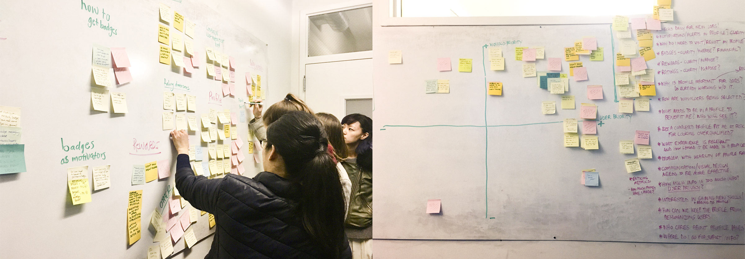
We conducted 8 user interviews at the weekly user meetups that Wonolo held. The day after these events, we wrote user pain points on post-it notes and grouped similar opinions together. Then we weighed things important to the company with things important to users. After that, we discussed the problems that we must find solutions to in this project.
The Problems Discovered During Interviews
After we narrowed down the enormous amount of user opinions in our discussions, we sorted the opinions into order from the largest. From this, we were able to identify 4 main pain points that users had with Wonolo.
Idea Sketch
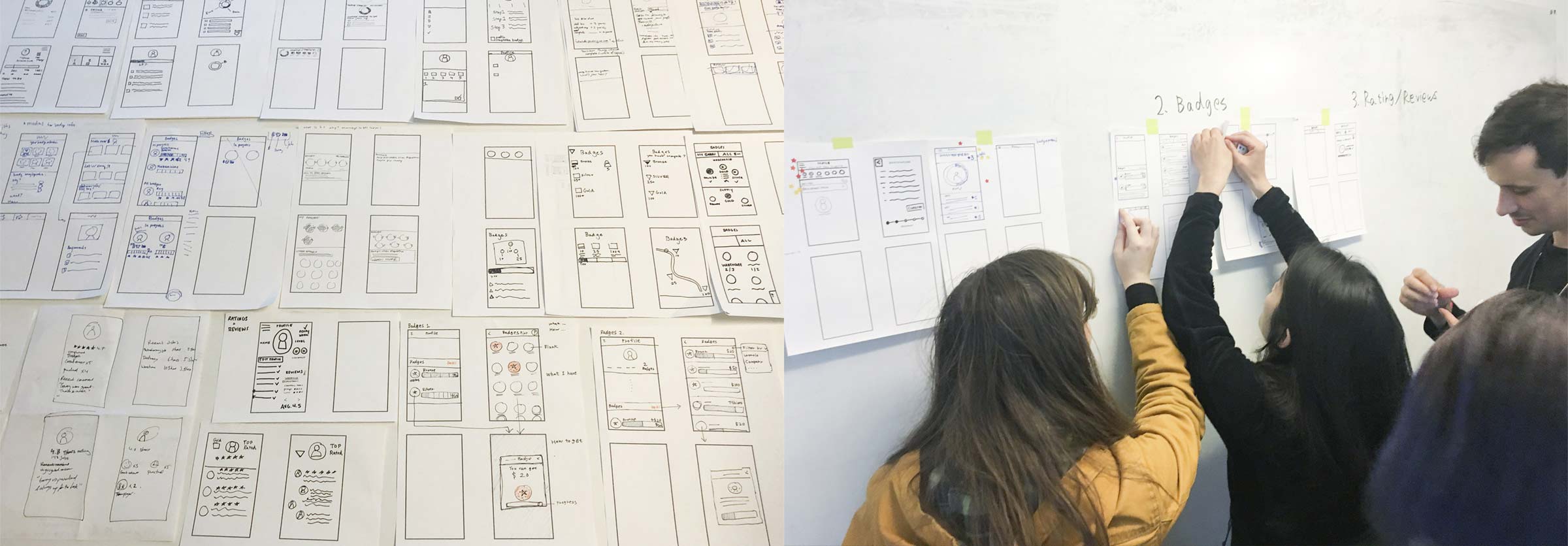
As co-leaders, Jason Wu and I created a plan to improve the parts of the product the needed it based on the research results. We held idea sketching workshops called design studios in which multiple members in teams simultaneously thought about each of the items that needed to be improved and tried to produce the best UI sketch. We repeated this for 3 rounds and then had a vote to decide the design direction with everyone’s opinion included.
UI Design
For this project, it was necessary to create designs for 3 platforms, Android, iPhone, and the Web. I created the design and performed user testing for Android first because a lot of Wonolo’s users use this platform. I repeated the verification and introduced the design that was decided on.
Navigation
Up until that time, a drawer slide menu had been adopted for the Wonolo app. However, it was difficult for users to know where the profile menu was located. This was a problem for Wonolo because it was preventing users from receiving the profile input achievement. Therefore, I changed the drawer slide menu to a bottom navigation menu so users didn’t need to tap anything but they could see each menu item.
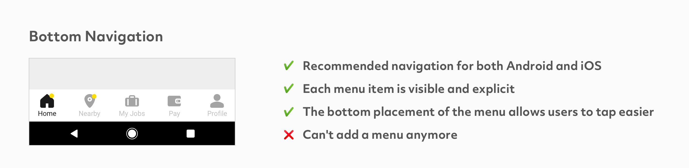 In recent years, bottom navigation menus have started to be adopted more and more because device screens such as Android are getting larger and it is making it difficult for people to tap items on the upper part of their screen.
Delivering Necessary Information to Users with Various Card Forms
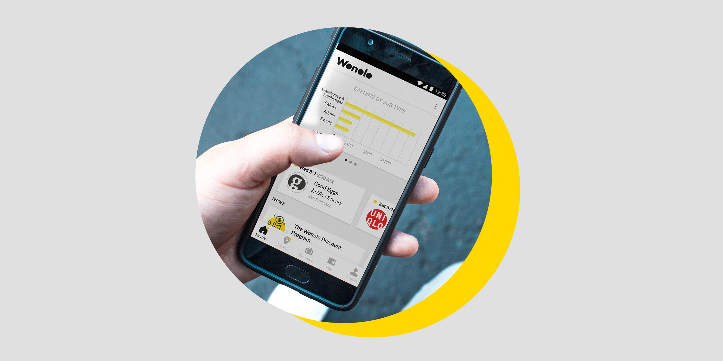
Although the client did not request their home screen to be redesigned, I thought they should make improvements because our user research showed that many users were not using the home screen and quickly going to other pages. The company’s home screen previously only displayed a row of notifications from Wonolo. I redesigned the screen to display the user’s total earnings, earnings over time, previous job types, and their next scheduled job.
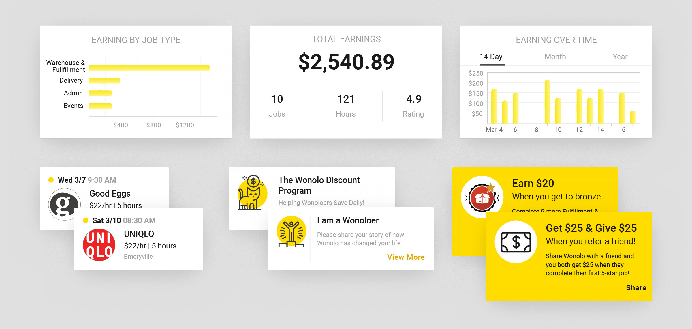
The New Dashboard Home Screen
Display Status of Badge Achievement & Enjoy Job Hunting like a Playing Game
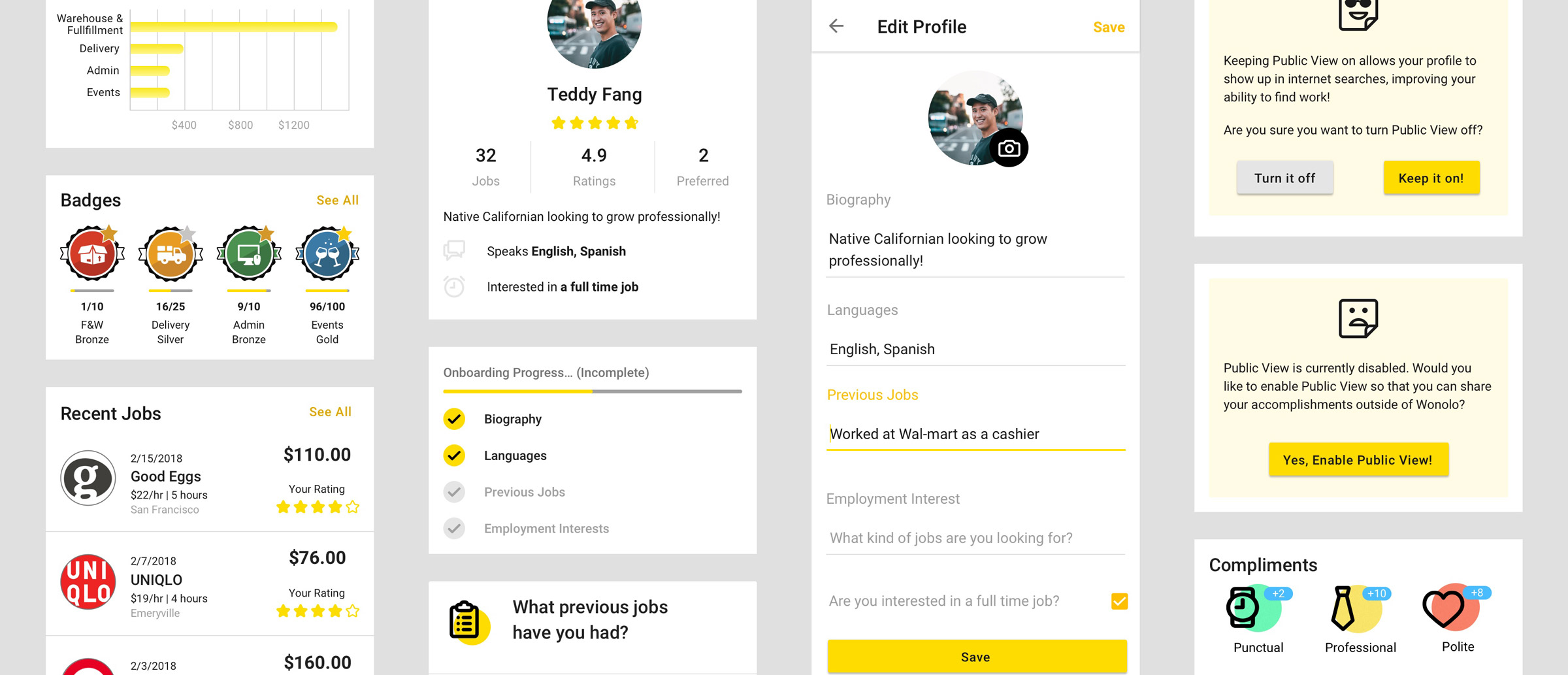
Users did not fully understand what kind of badges they could receive or when they would receive them. So, I put a progress bar for badges that displayed the requirements need for a user to achieve the badge. I then created a modal screen which displayed the kind of reward the user would receive after they earned the badge.
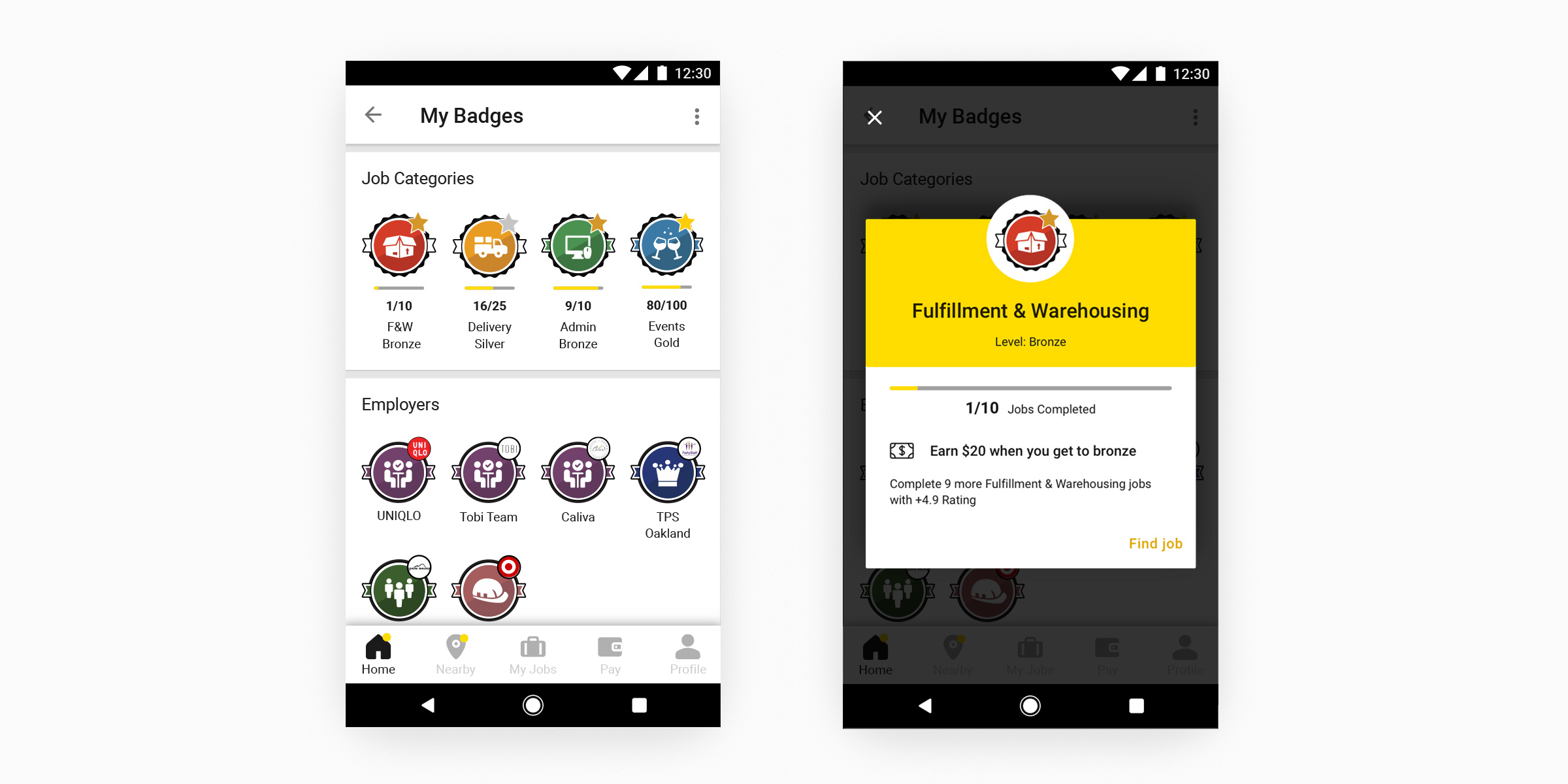 A user can confirm badge details when they tap on a badge under Job Categories.
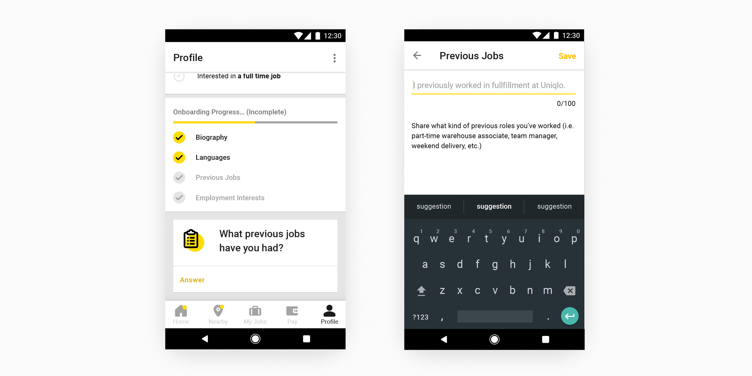
How much is left to Input to Finish My Profile?
The profile input progress is displayed in very easy to follow steps. In addition, users can easily know what question they should answer next and they don’t even need to tap anything. This is because I made the design to show a popup displaying a question asking them to input the necessary information. The answer form displays an example in order to limit a user’s hesitation as much as possible.
What Kinds Information will be Display on my Profile? A Design to Remove User Anxiety
In order to remove user anxiety when they open an account, I added a confirmation screen and restated what they can expected when they set their account to open and the merits of doing this action. It is only possible to share a profile if the open setting is turned ON.
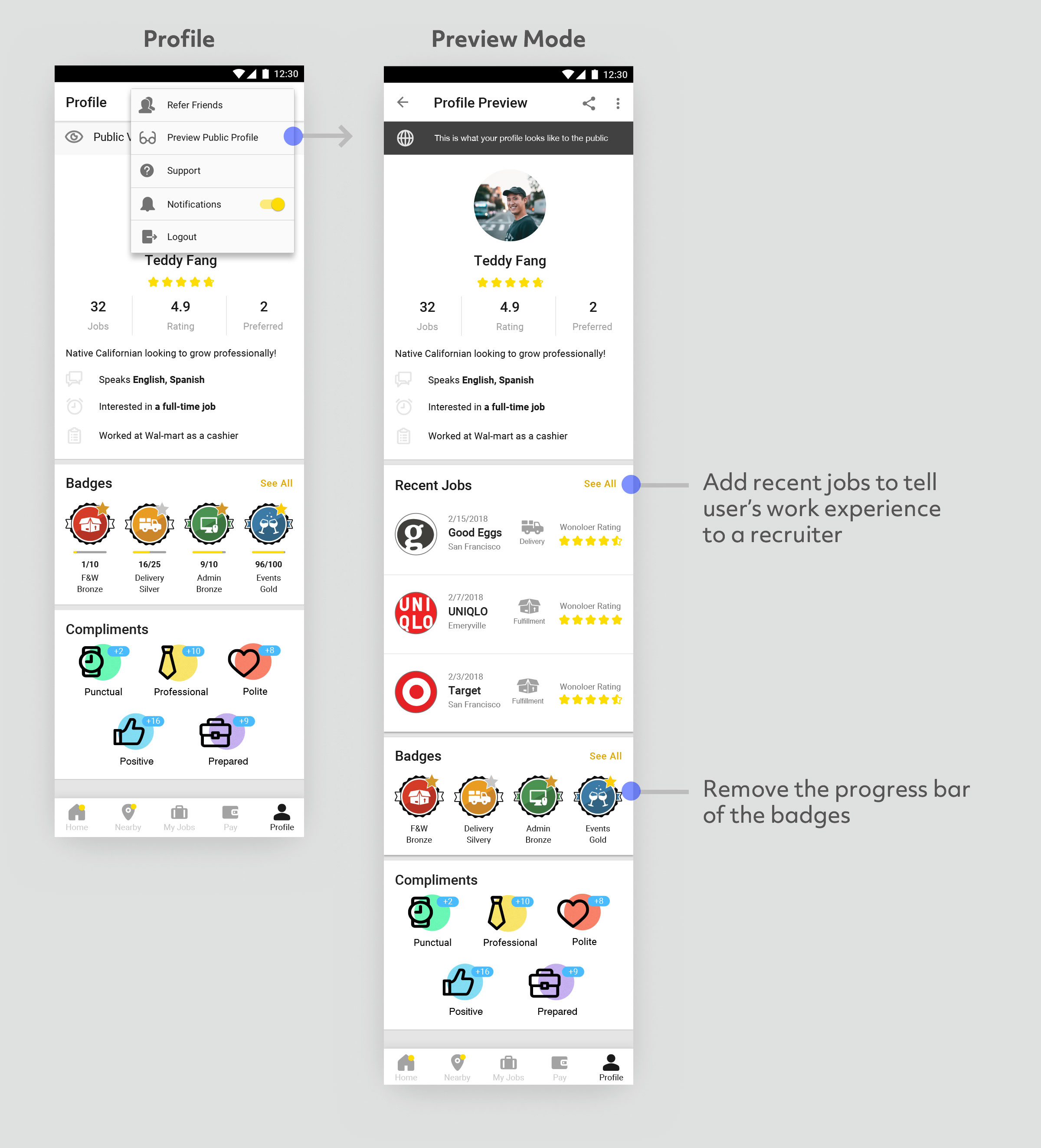
The Difference with the Preview Screen
I created a new preview screen so that users could confirm how recruiting staff from companies see their profile information. Although the new design allows recruiting staff to view a user’s recent employment, they cannot see a user’s badge progress because that function was created for the user.
Users Receive Praise from Companies
At First, we created a design that allows companies to add a review comment at the same time as they give a star rating to a user in order to make user profiles more attractive. However, companies were unable to leave comments for each staff because they were employing large numbers of part-time staff daily. For this reason, we had to make it easier for companies to praise users so we changed the evaluation system. The new design asked companies to select an appropriate praise from a list of 3 options, Punctual, Polite, and Prepared.
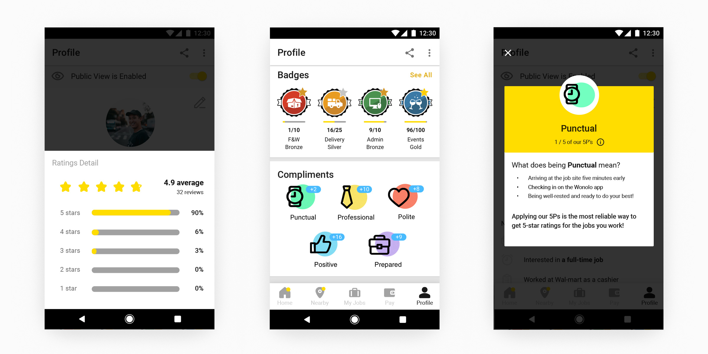 Users are easily motivated because they can see more than just a numerical value displayed from a star evaluation. In addition, companies are able to see what kind of person the user is and they can use this information to make hiring decisions.
Next Steps
This project was performed in 1 month. However, I found a few other items that I think we could improve although I did not address them within the scope of this project.
- Reorganize the badge system
- Although there are level up badges that handle the frequency of jobs done in a specific industry under the heading called Job Category, work for other badges is different. Therefore, I think it is necessary to separate them by changing the names and graphics.
- Add a Calendar Function
- Currently, when users look for a job they are provided with a list view or a map view. However, if there was a calendar function as well, users would be able to conveniently manage their schedule as well as easily confirm the dates that they are available to work before they choose a job.