Laughly 2018
Laughly is an audio-based comedy streaming app. They aim to become a platform that creates and promotes comedic brands at an individual or organizational level. They desired to integrate both audio and video formats into the app, and to bring the audience and comedian together to create a social community. I tackled designing the new channel page structure and led the design team through high-fidelity and prototyping.
User Insight
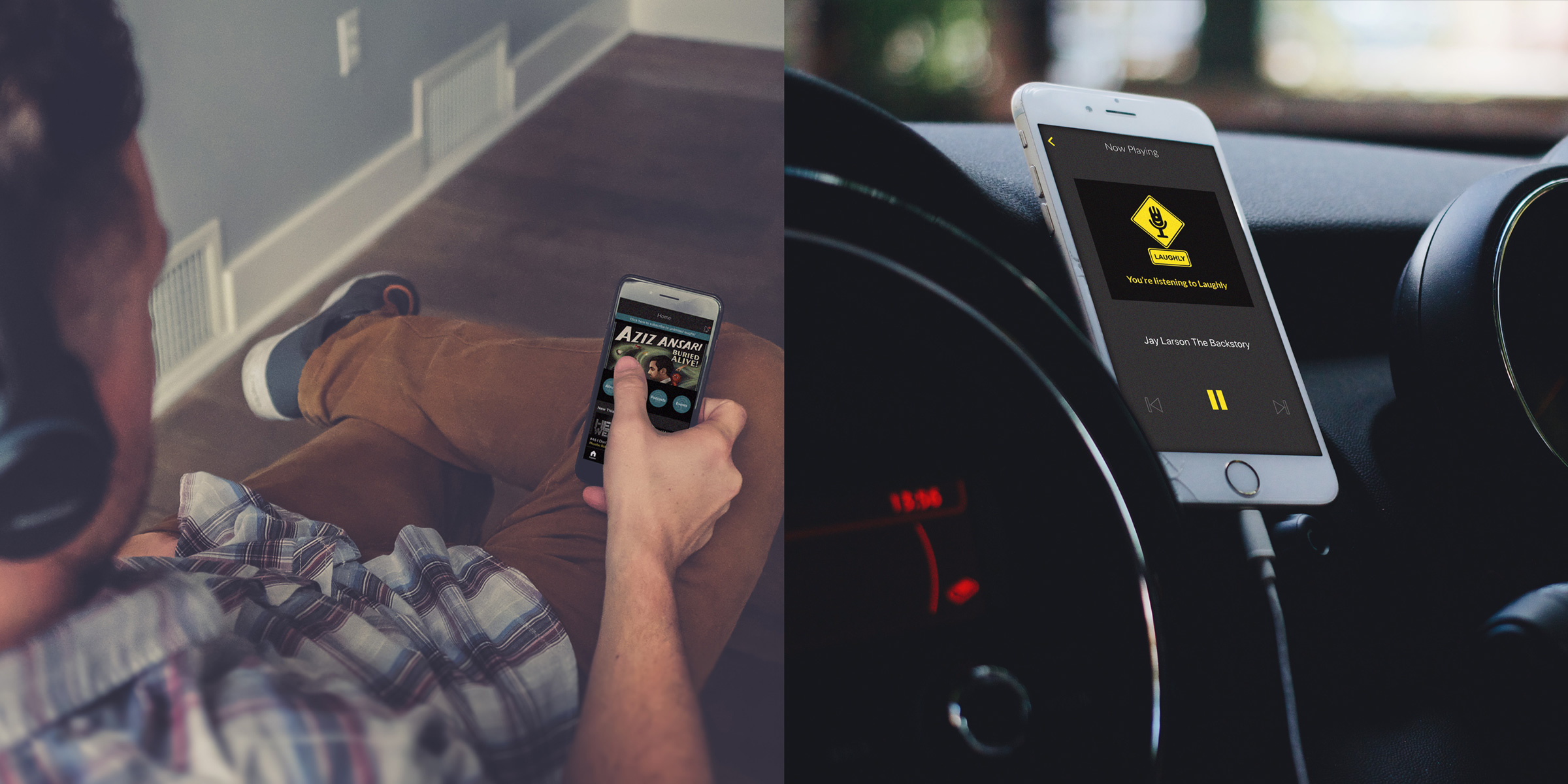
We kicked off the project by interviewing people who use Laughly or love comedy. Users said that if Laughly started providing video content, they would gladly watch. Users also told us that they usually listened to the audio in the background while performing other actions such as while driving during their commute.
Issue1: How can users switch between consuming video and audio easily?
Channel Navigation
On top of video, Laughly has several types of other content to keep in mind which include albums, podcasts, playlists. My design focused on how to organize the different type of contents to cater to an audience. I designed and iterated channel navigation. The design decision was prioritizing to separate types of content into ALL, AUDIO and VIDEO based on the user insight.
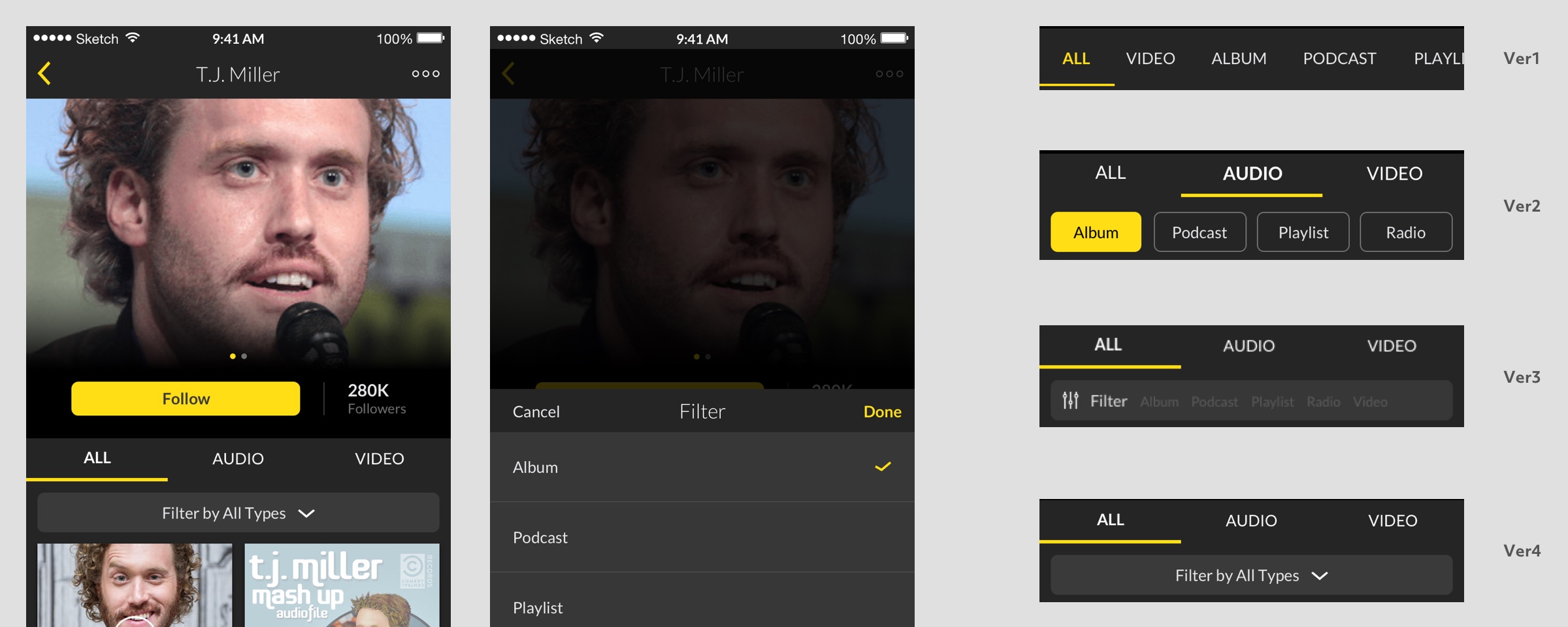
- Ver1: The initial design was to align with all type of contents, but that made it harder to navigated between the two content types
- Ver2: Added filter feature instead, but this design for the filtering might not scale well in the future.
- Ver3: Changed filter UI, and tested it for usability. Users felt the filter option was inconspicuous and some users thought this filter button was a search box.
- Ver4: The final design, modified the filter button.
Thumbnail
Audio and video formats had to be distinguished for combining these on one screen. The critical difference between audio and video formats is the ratio of the thumbnail image size, and the presence of a play button.
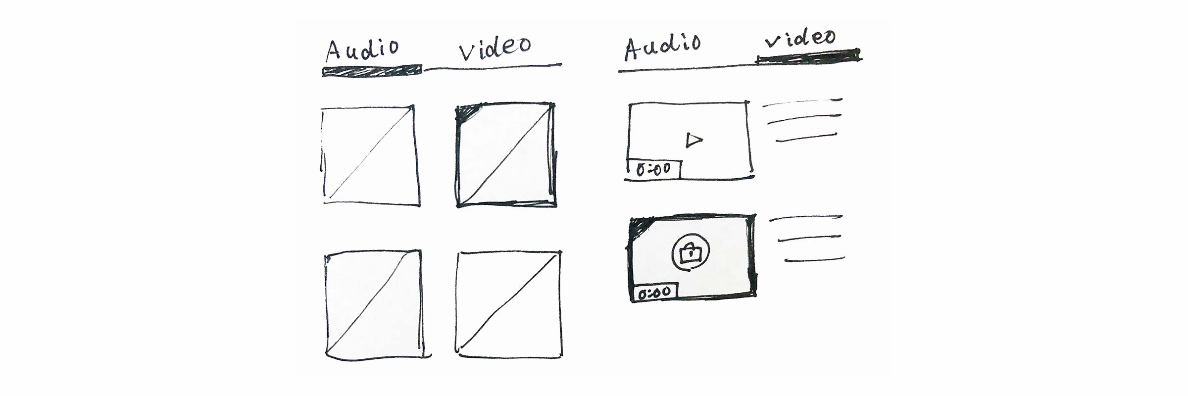 Initial sketch
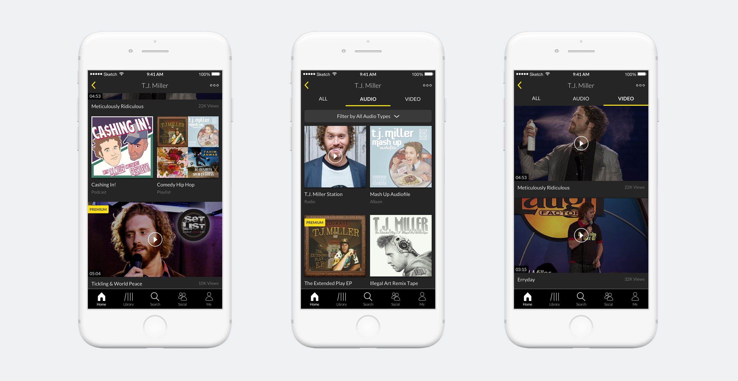 Final design
Issue2: Digging for what other users would recommend
Building Laughly community was also their aim. But all 6 users we interviewed were not overly interested in having a social presence. On the other hand, they were enthusiastic about what other users would recommend. So we decided to improve how to show users opinion of contents.
Change the label Comment to Review
Users were confused by the comment feature on the channel page. Was it for the artist? The content itself? So I changed the label Comment to Review. By moving it to the deepest content page such as the album, playlist, and media player, I clarified what the user was writing a review for.
In a media player, the review feature shows up at the half of screen to read reviews during watching album cover or video without transition.
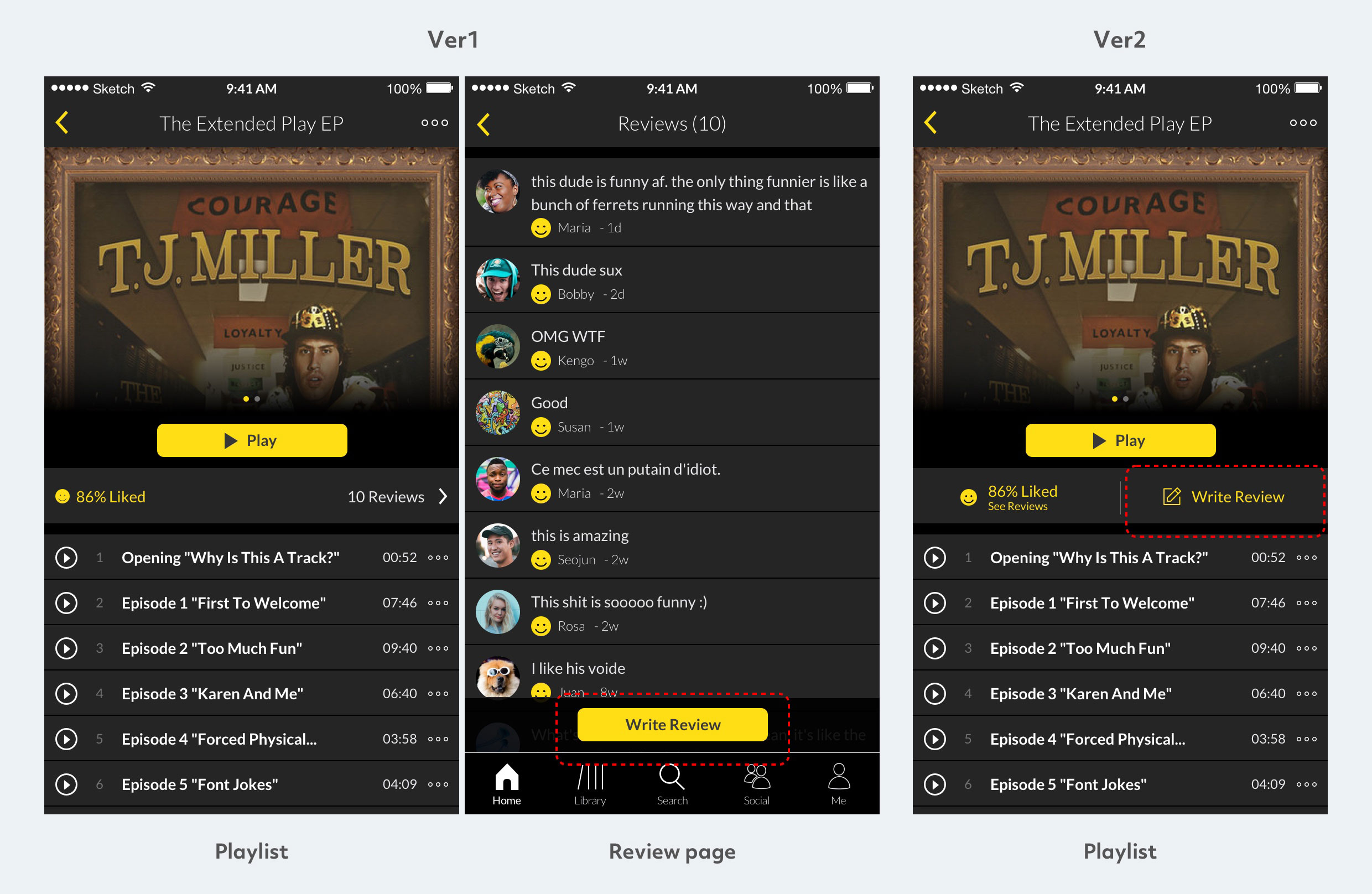
Review button
Users found that the Write Review button was too hidden, which would deter them from engaging with it without being prompted. I moved the Write Review button to next to the rating on the playlist page. This made the button easier to find, and allowed users to go directly to the review page to write.
Design System
I focused on mainly UI design, worked in Sketch, made the design system and bunch of components to allow 8 designers to design consistently.
Sketch symbol
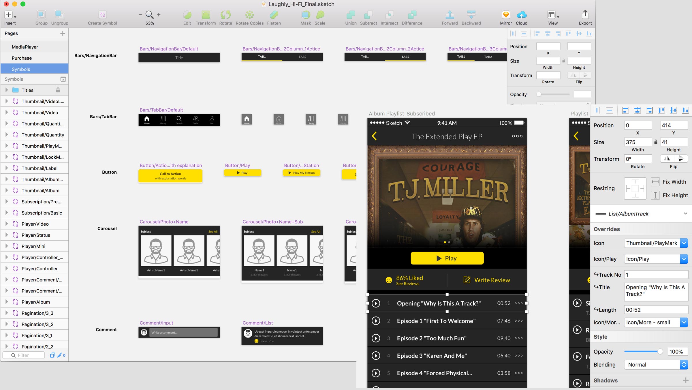
We had to make a lot of screens and iterate it frequently to validate usability. My challenge was making Sketch symbols that other designers can override the symbol easily and efficiently.