Stimpacks Brand & Package 2018
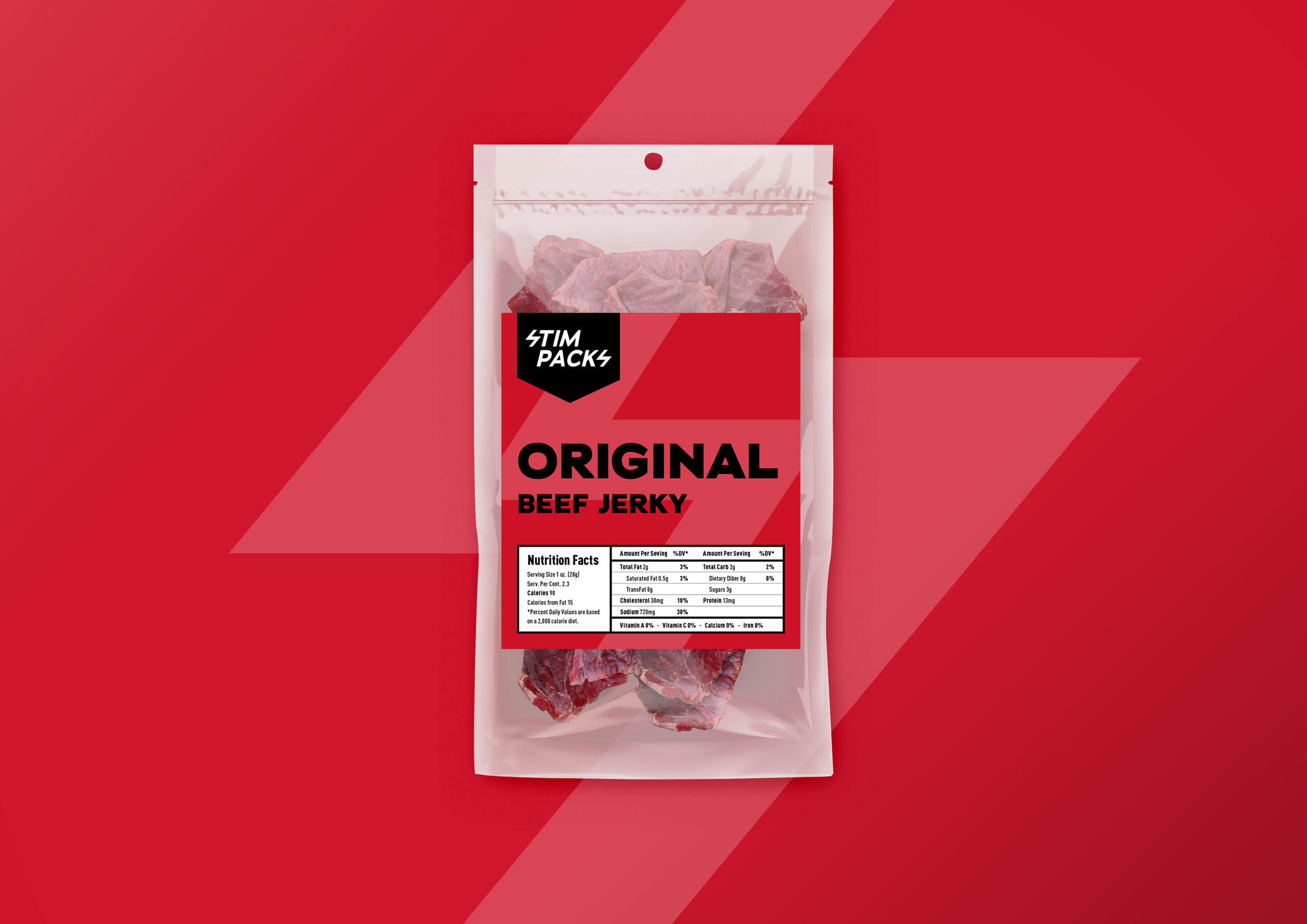
I designed the logo and packaging for Stimpacks, a San Francisco based snack company. The company targeted hardcore gamers with recovery items called Stimpack for games like FPS, etc. Although most of the visuals were of syringes and other medical supplies, I was very careful not make it too serious because I was aware that the company was a snack brand. I was told that they planned to develop other confections in the future so I designed the first product, beef jerky, with an idea/concept that would be consistent even if the product line expanded in the future.
Strategy
There are many hardcore gamers who play video games for very long periods of time and confection items are the best way to replenish energy during a game. I thought it was important not to interrupt the immersive feeling of users so I created an item that would give users a real world feel.
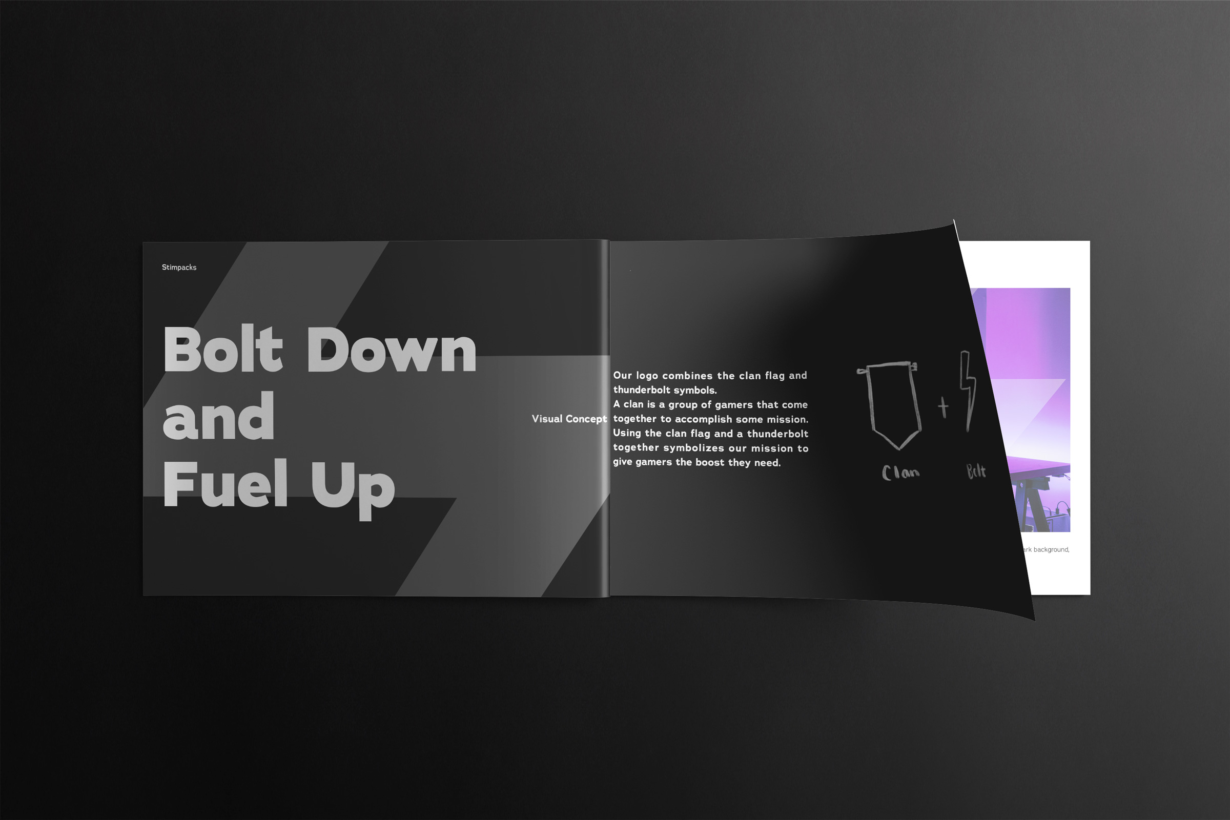
I got the motif idea from the game term clan, which is used to describe a group of users who come together to complete a mission. I created the logo with the letter S representing a lightning bolt because it gives users the impression that their energy will be replenished in a flash of light. The shape of the logo resembles the shape of flags used in the game to express different clans. These are thought to bind users who eat Stimpacks together as friends to join in on a struggle/battle.

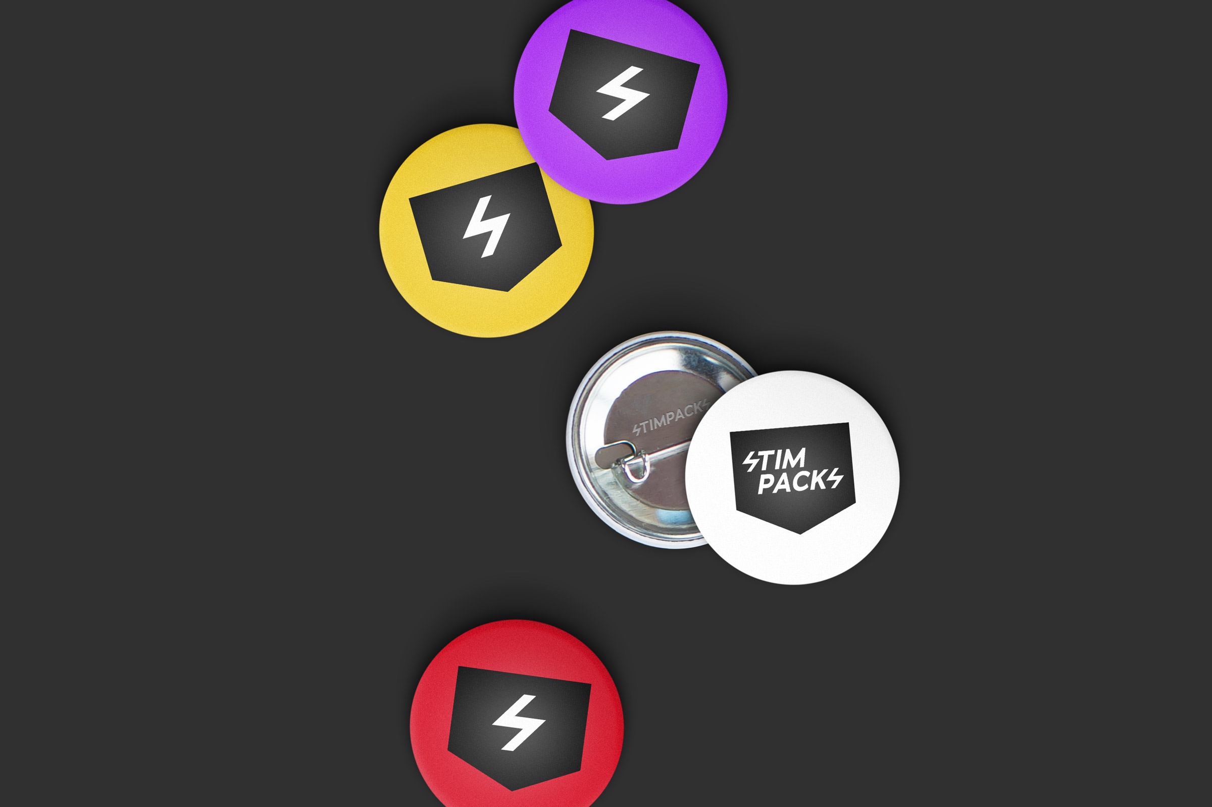 Even when the logo that only displayed the lightning bolt for social media profiles and the small sized icons for other media were provided, they were still highly visible and gave memorable impressions.
Package design
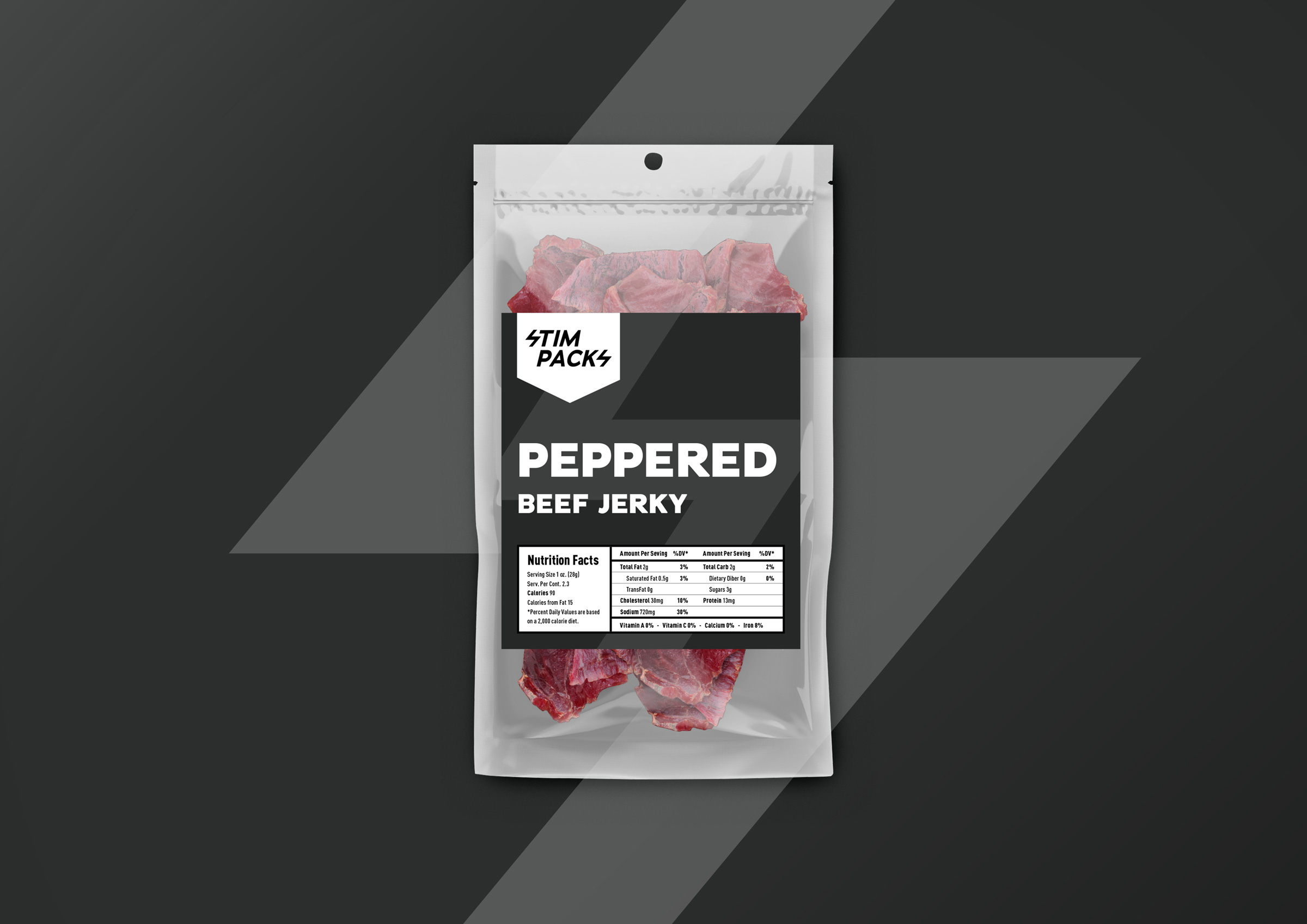
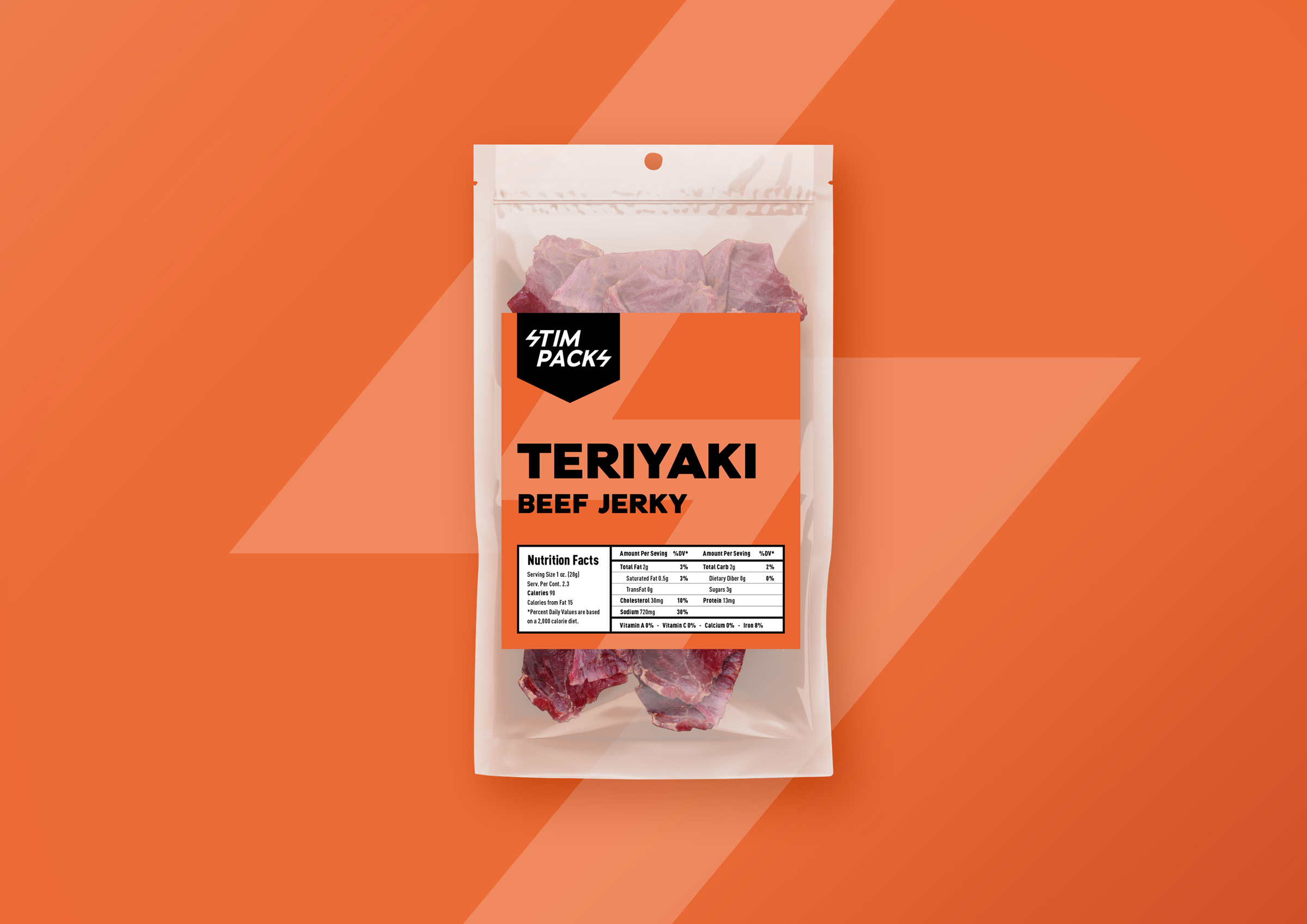
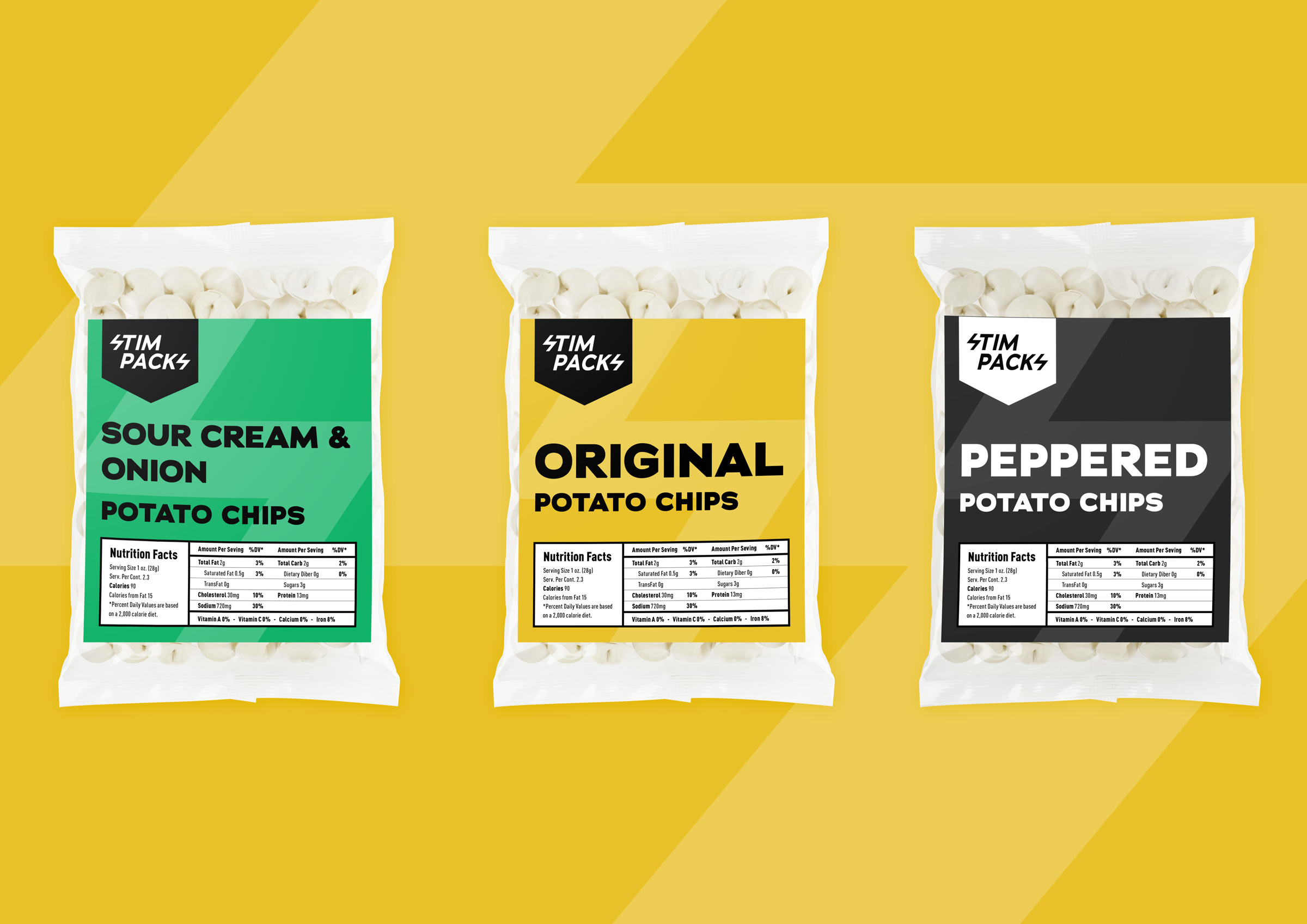
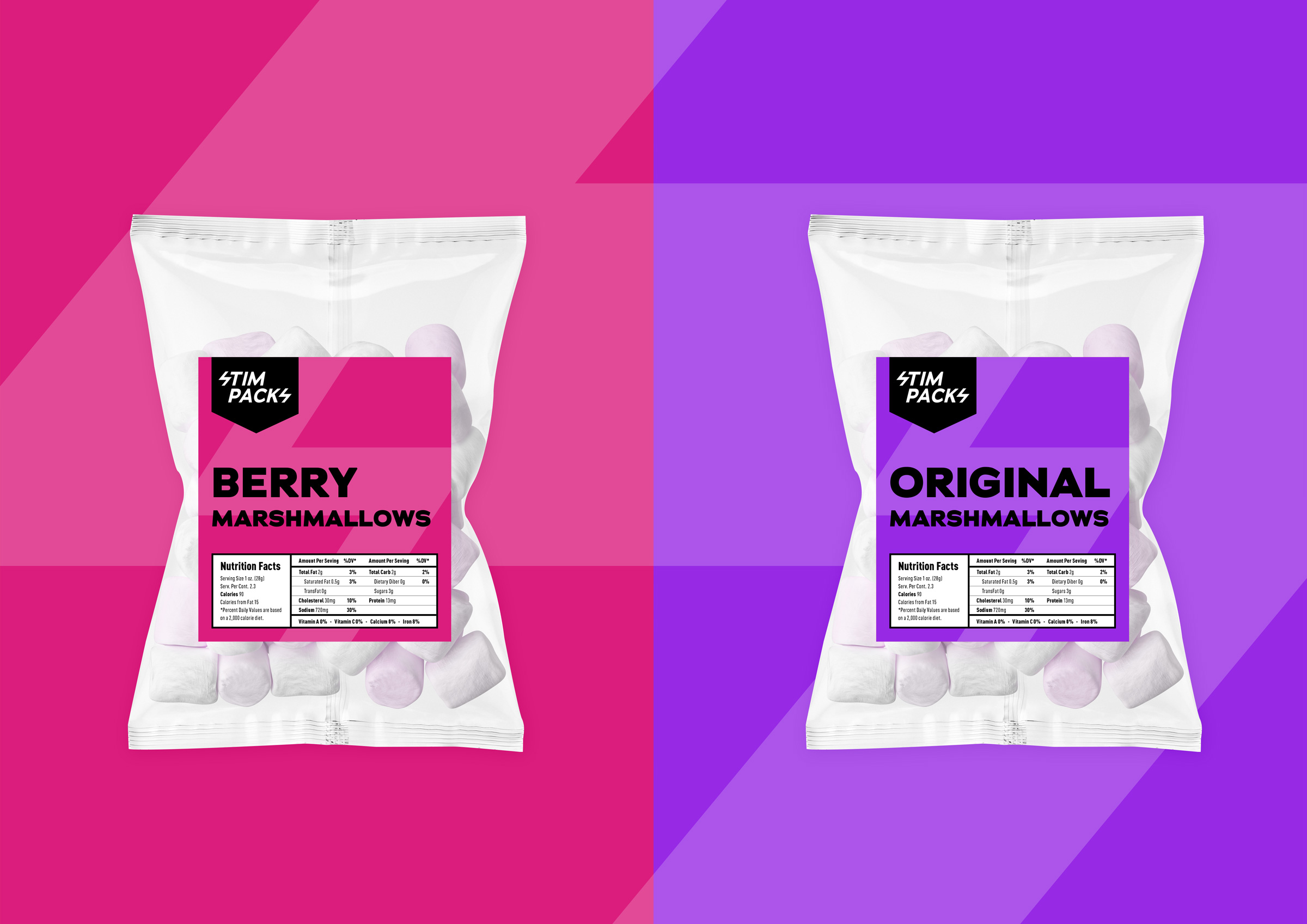
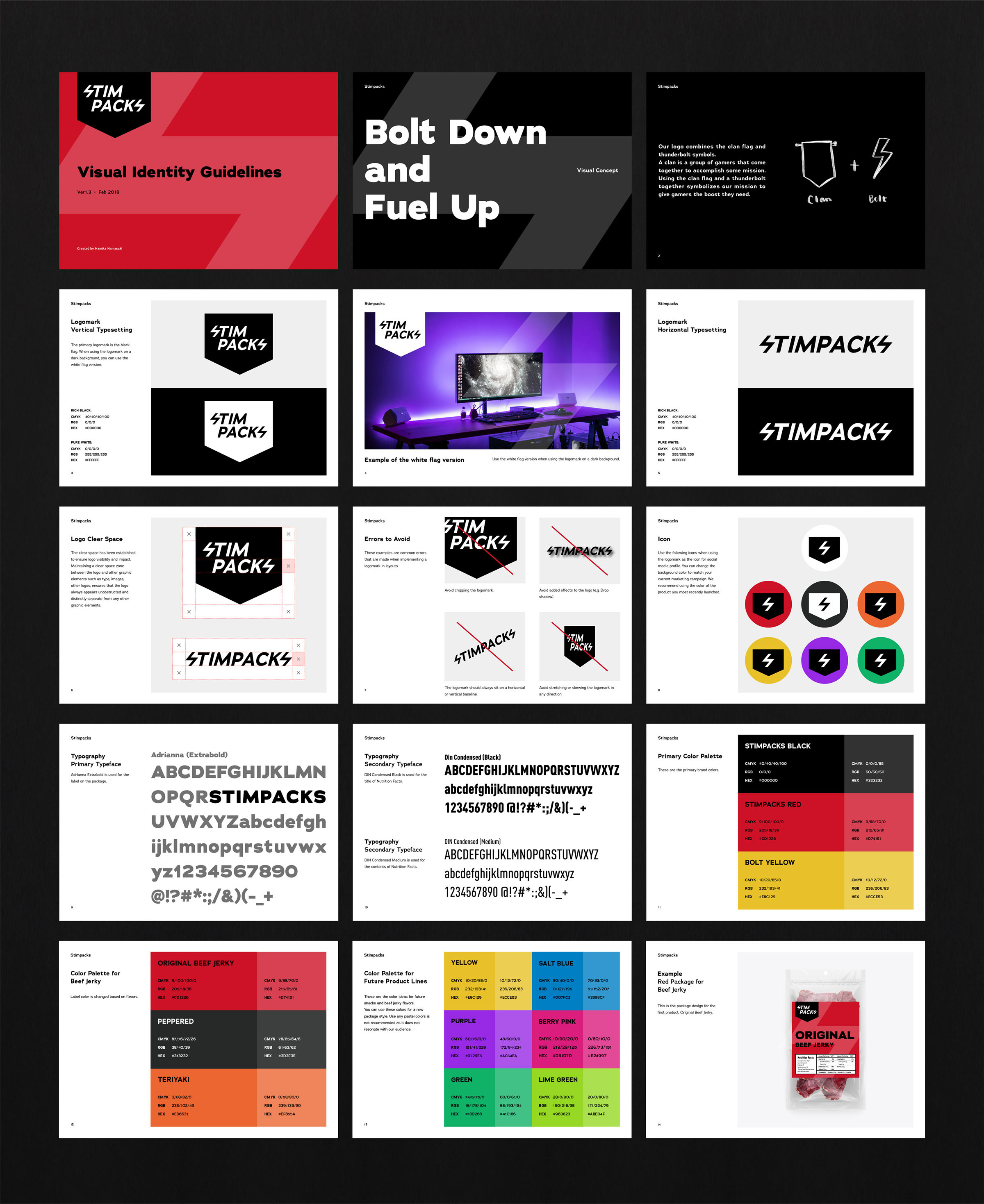
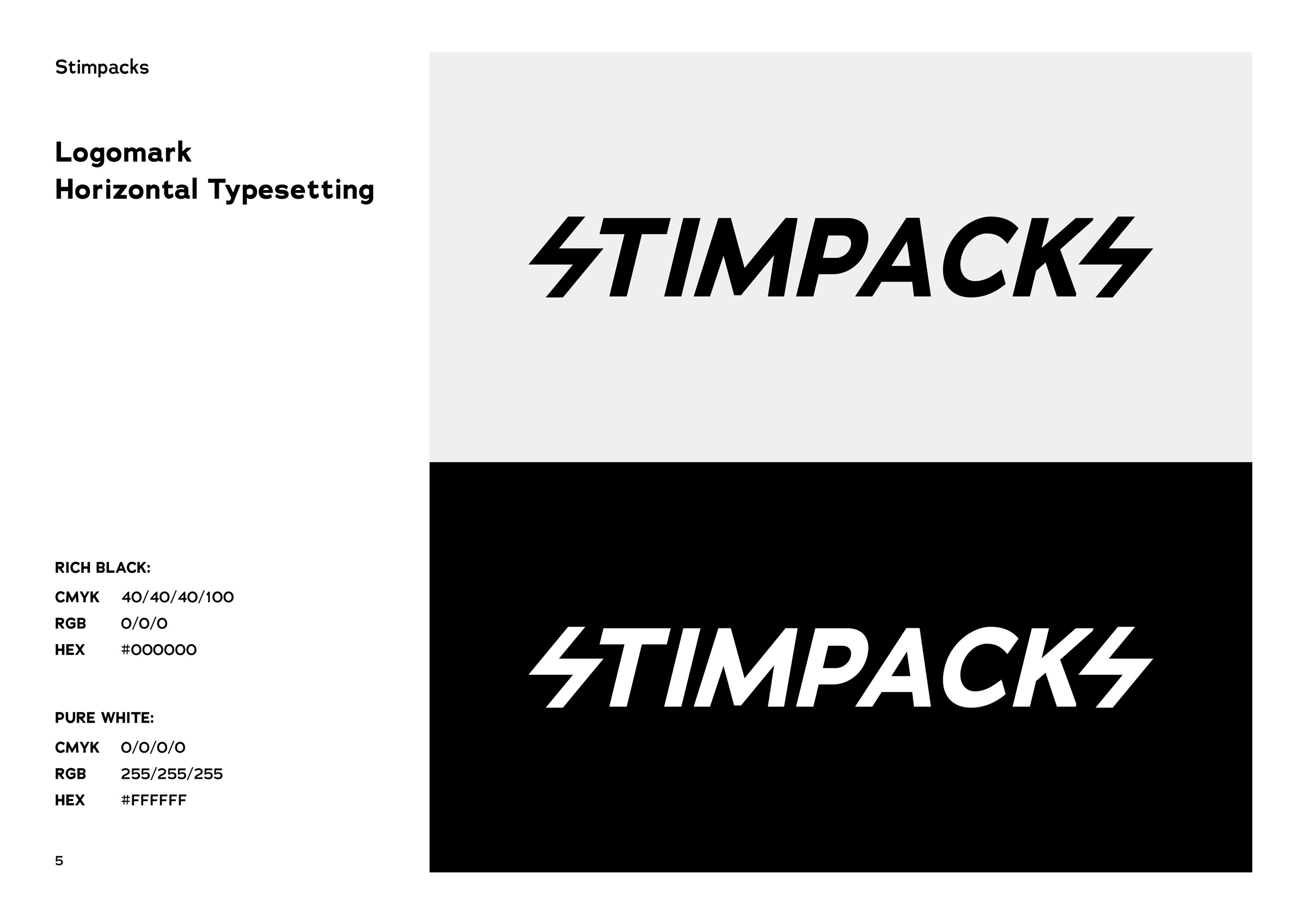
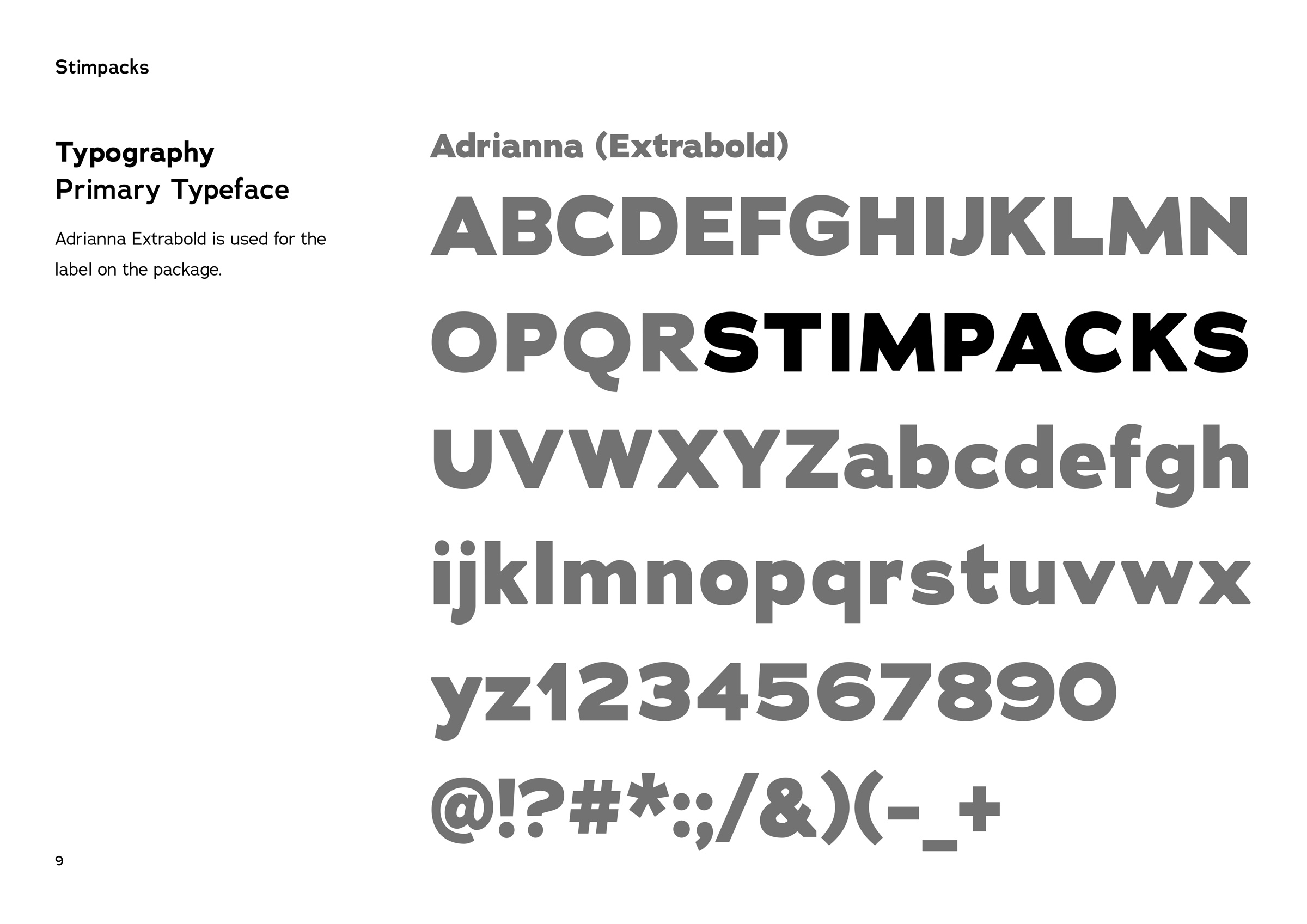
Brand Guidelines
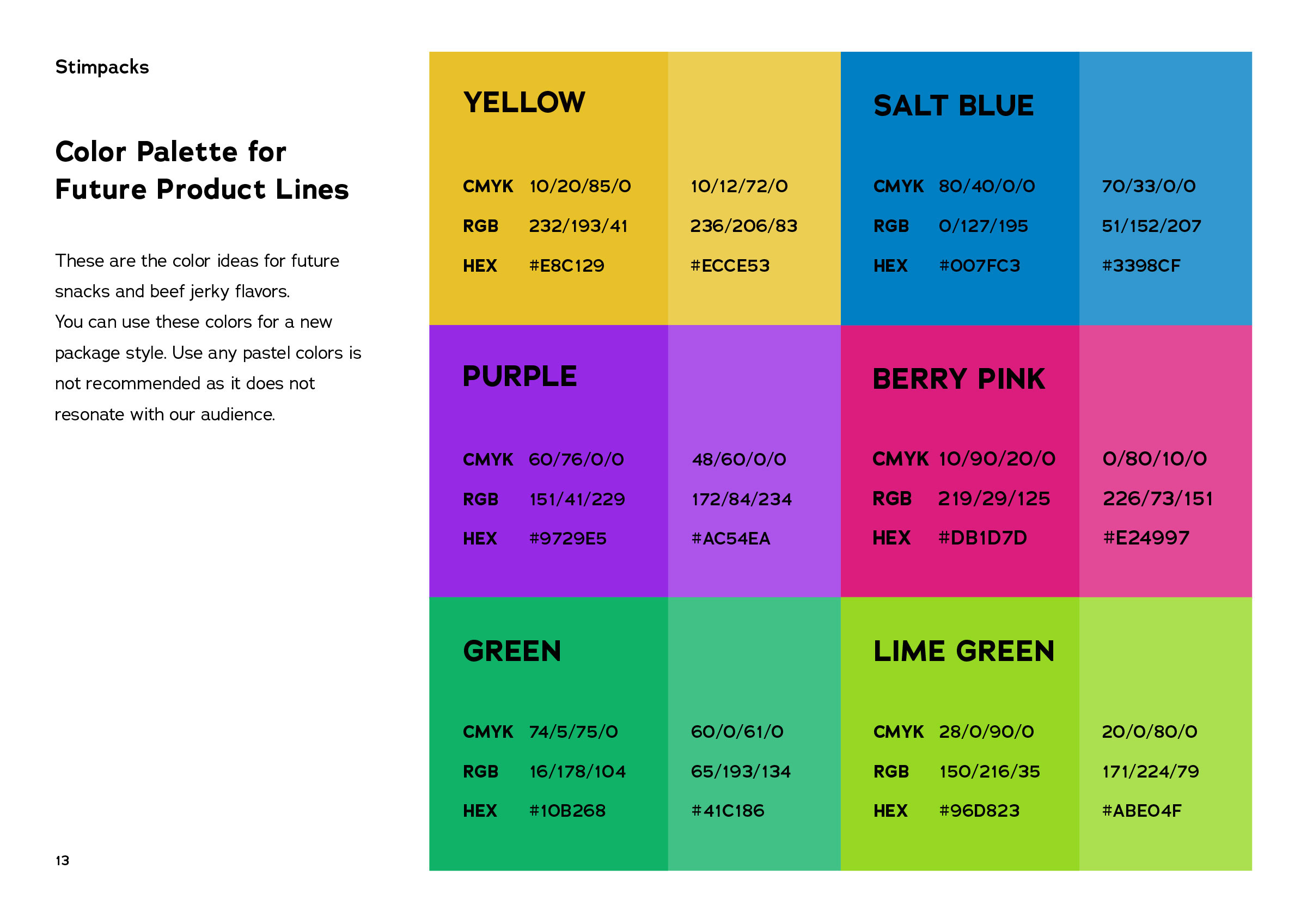
In the future, other flavors of beef jerky will be launched and other types of confections will be developed so I created a logo that follows the company’s guidelines and policies regarding color selection, etc.
