Finery Dashboard Renewal 2018
New York’s Finery is a service that collects data from users purchase history and creates an online wardrobe for users to organize and coordinate their clothing. The company’s website initially had a lot of functions that made it overly complicated for users. I redesigned the website and suggested a renewal of the dashboard, especially the calendar function. I took on the unification of the creative, decided on new rules for the size of blanks and the color that displays Finery’ s world view. I led a team of 5 designers who worked well together and the project ran smoothly.
Problems & Goals
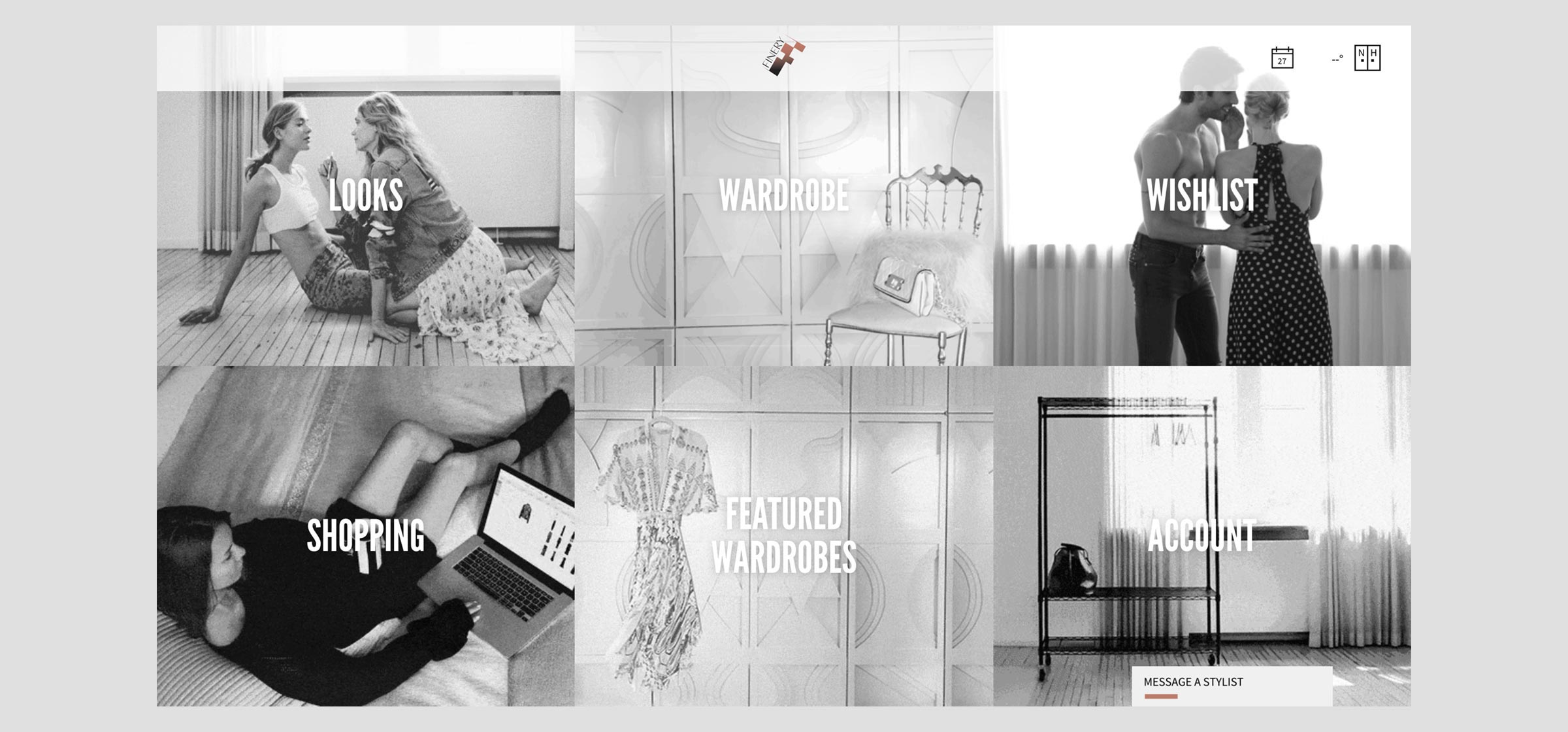 Finery’s Dashboard Prior to Renewal
The main user experience was difficult to understand because there was a menu consisting of 6 options on the main screen of the dashboard. As a result, there was a decline in user actions, so increasing user engagement was a problem. Therefore, it was necessary to design the functional dashboard in a way that would increase the usage frequency of the coordination feature to keep users interested.
We set our project goals as follows:
- Create a dashboard that provides personalized contents
- Design the calendar to display a daily schedule and coordination
- Build a design system that can be used to design a new dashboard with consistency.
Core User Experience
At first, I performed several UI sketching workshops called Design Studio. In these workshops, we discussed what kind of interface we should use for each function on the dashboard.
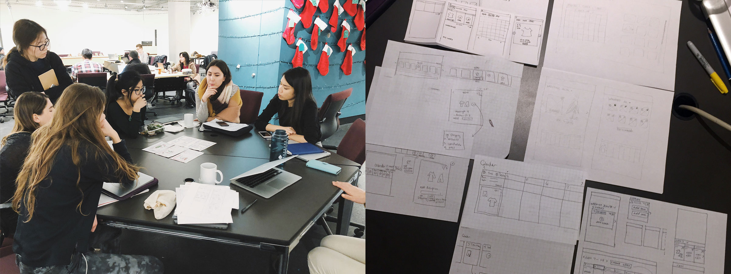
Other than Finery’s calendar function, the company also has other important functions such as, the Returned Goods Alert, the Sales Alert, and the Referral Introduction. At first, I designed the new dashboard with a direction of including these functions.
However, while I was repeating the sketching process, I noticed that these functions were not a core part of the user experience that focuses on shopping although these functions are important from a business viewpoint. Therefore, I defined Finery’s main experience as managing a personal wardrobe that is useful for inspiring daily clothing coordination. Since I defined the main experience in this way, I decided to redesign the dashboard to include the calendar function only.
New Dashboard Design: Calendar Function
Improvement of Design Rules
I gathered all the components and noticed that the color and shape of the buttons and the blank sizes were inconsistent before I created the mockup. Therefore, I decided on the design rules for the website and created a new set of guidelines.
BEFORE: One Part of the Component on Finery
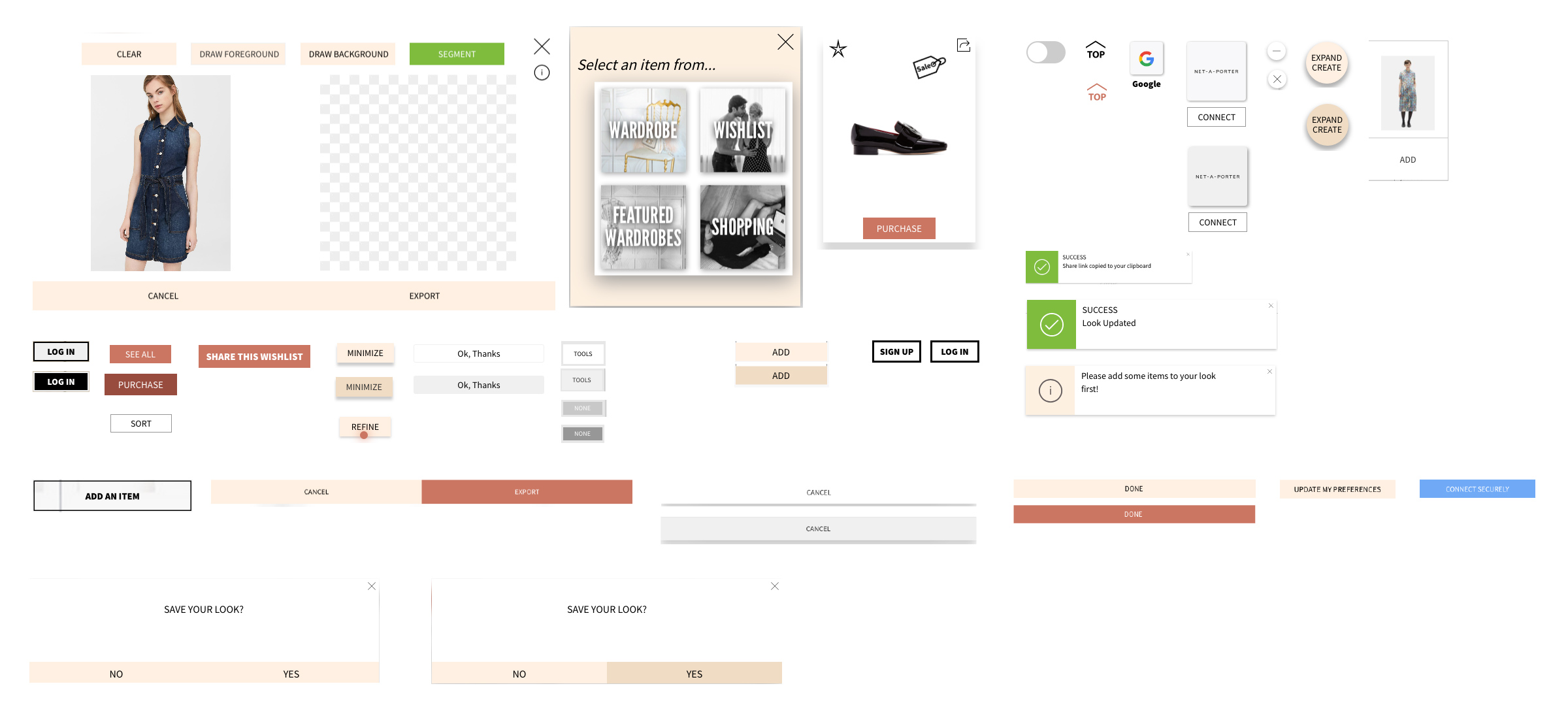
AFTER: New Design Rules (color, etc.)
The user became confused because the same color was used to display the two options (Yes/No). Additionally, although various colors such as blue and green were used on the website, the colors projected a world view that differed from fashionable Finery. Therefore, I made the components and buttons with only a limited number of colors (a neutral color, black, orange for Finery branding). Other than color, I also unified the size and style of icons.
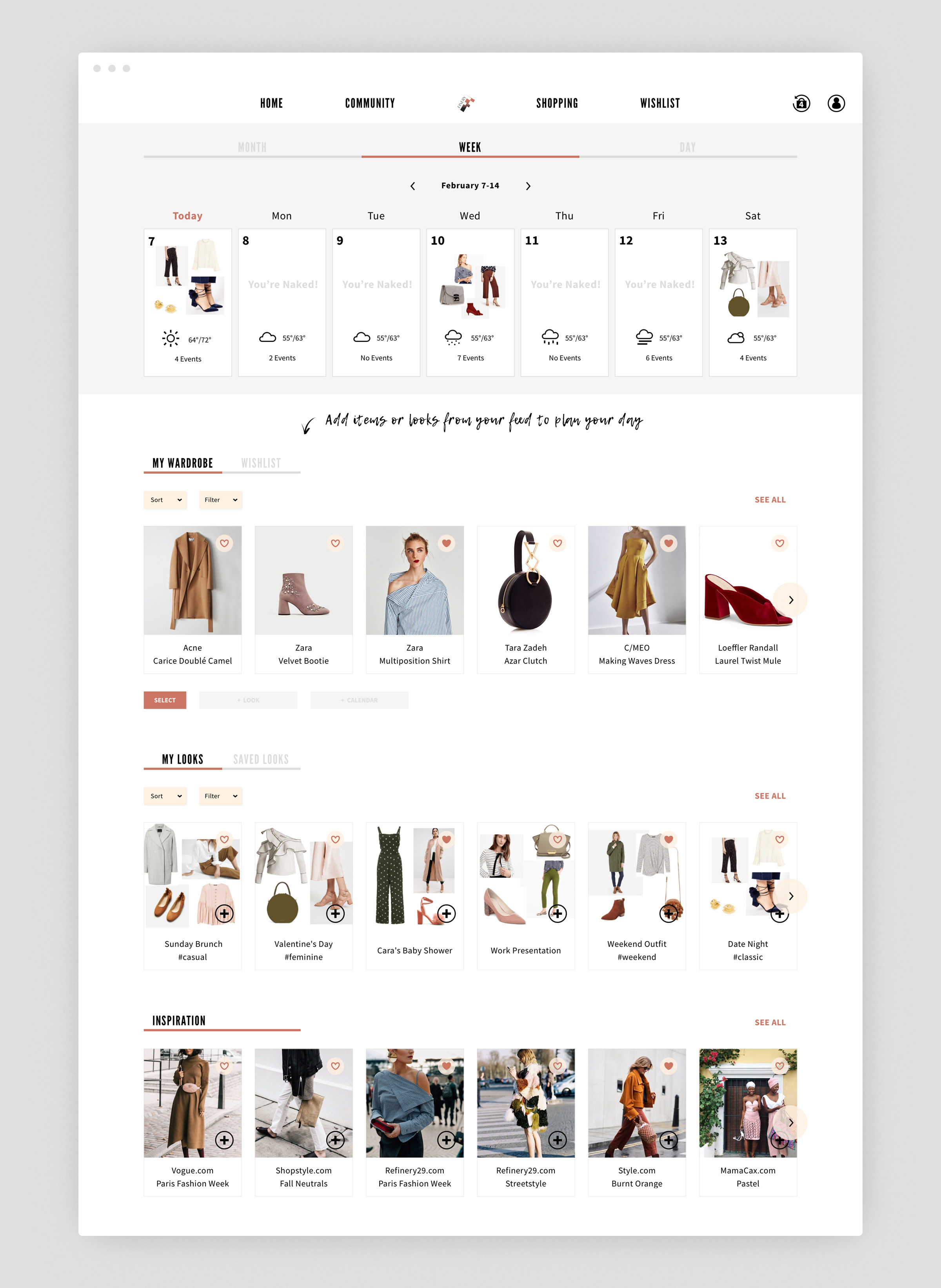
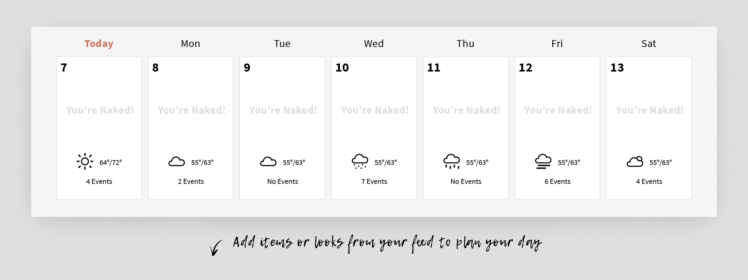
Calendar View
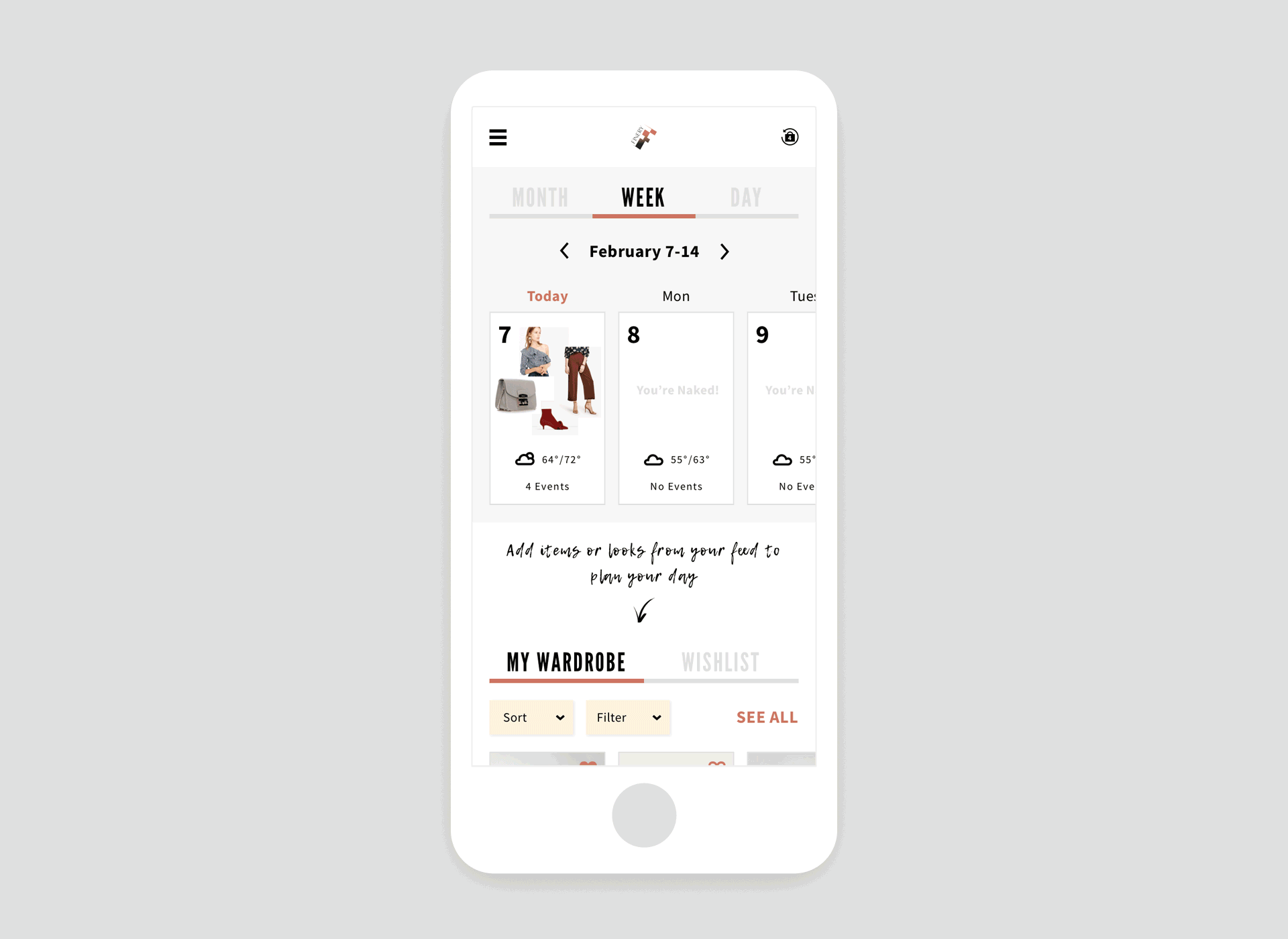
The calendar became an icon function on the new dashboard. The calendar view can be changed to day, week, or month depending on the user’s preferences. I made the design to be responsive to the 3 different calendar views so that they can be accessed from any device.
Week View
From the user interviews that I conducted, I learned that a lot of users think about coordinating by week so I made the weekly view as the default display. I designed it so the current day would be displayed as Today on the far left since users cannot confirm the entire week without swiping.
Month View
The month view of the calendar is useful for people who want to think about coordinating their clothes a few days before they travel. Users can confirm a list of their coordination by month when viewed on a desktop computer. This switches to a simple layout with only dates displayed on mobile phones and users can quickly know which dates have a registered coordination.
Day View
The day view has the biggest coordination photo compared to the other views and users can also confirm the day’s schedule as well.
Detail View
Users can confirm the entire day schedule, add plans, and can also view the item list.

When there isn’t any registered coordination on the calendar
When there isn’t any information on a user’s calendar yet, a slightly playful comment (“You’re Naked”) is displayed to invite users to register a coordination.
Item Feed Design
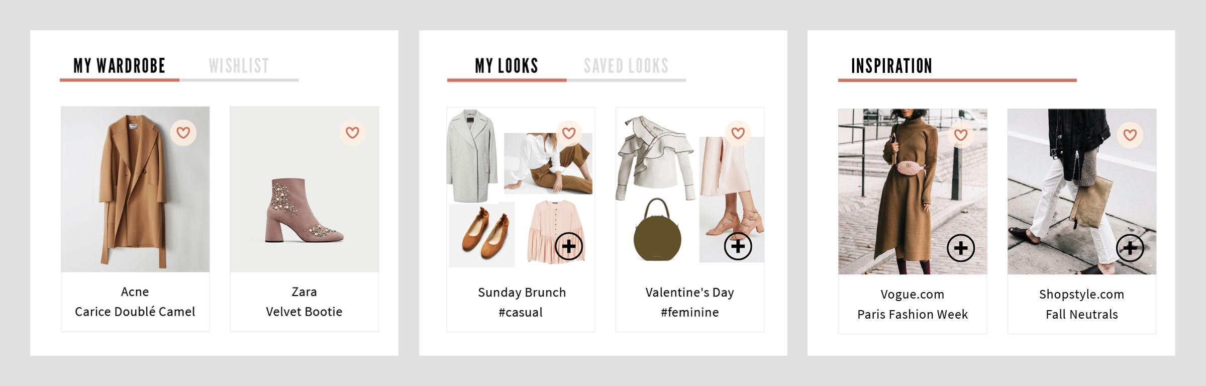
Although Finery’s design was becoming complicated, a number of coordination items could be added to the calendar.
- Your Clothing
- Your Wishlist
- A Coordination collage created with items from EC sites
- A Coordination collage made by other users
- Snapshots of famous people
I divided these into 3 headings (My Wardrobe, My Looks, and Inspiration) and then complied information related to My Wardrobe, Wishlist, etc. and put it in the tabs. Users can choose items from 3 headings and register them on the calendar.
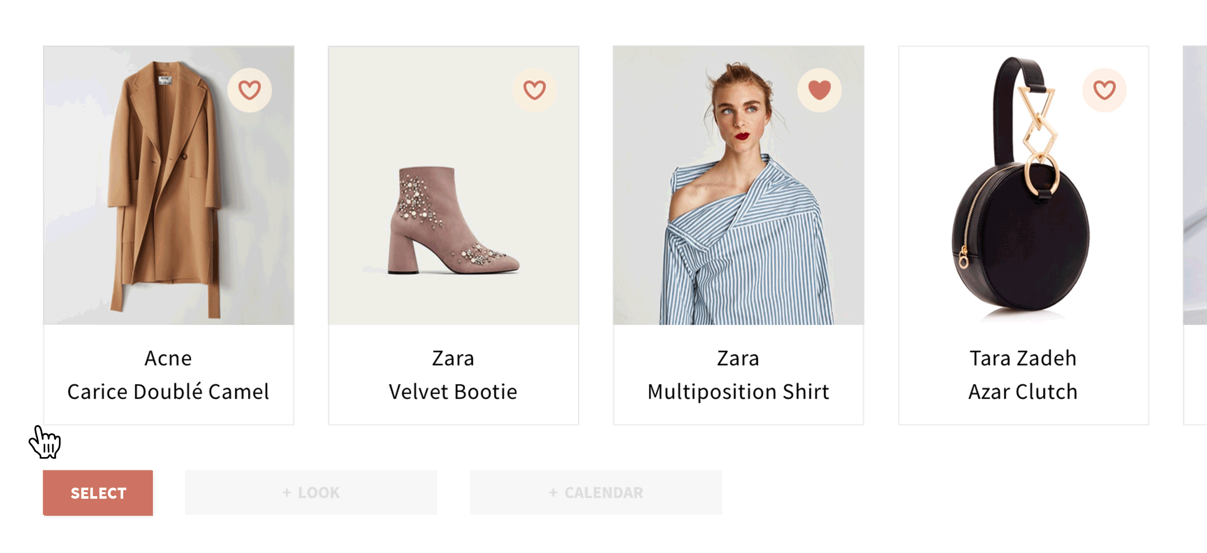
Multiple Selections
Users can choose multiple items and register them on the calendar and My Looks. The point of my design was to make items from the wardrobe easily registered in order to increase the number of times users make a coordination.
Wrap Up
I not only changed the layout of the dashboard, but I also redesigned the website by making the calendar the starting point of the user experience because the original website was confusing for users. In addition, as a personal challenge, I was responsible for making all the decisions on the visual side as the Creative Director.